Let’s try a simple exercise now.
We have this HTML file:
<!DOCTYPE html>
<html>
<head>
  <meta charset="utf-8">
  <meta name="viewport" content="width=device-width">
  <link href="style.css" rel="stylesheet" type="text/css" />
  <title></title>
</head>
<body>
  <div>
    <h1>Buy this great tool</h1>
    <p>Trusted by hundreds of companies</p>
    <ul>
      <li>Google</li>
      <li>Apple</li>
      <li>Meta</li>
    </ul>
    <button>Find out more</button>
  </div>
</body>
</html>
This HTML looks like this in the browser:
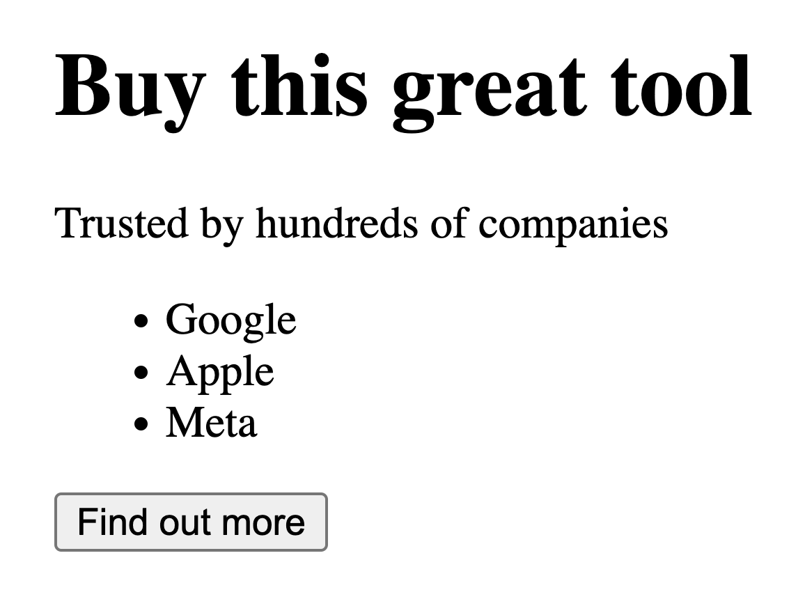
It’s not “bad” (we can call it brutalist) but it’s a little… poor.
We can transform this using CSS into something better looking and pleasant to the eye, like this:

We can do so by adding some CSS.
The information that those two images provide is the same but there is a big difference.
The second one looks very polished and very nice.
The first on the other hand looks like it was made in two seconds and it’s not something that I want to trust.
A little bit of CSS can do wonders.
We won’t change the HTML. Just the CSS.
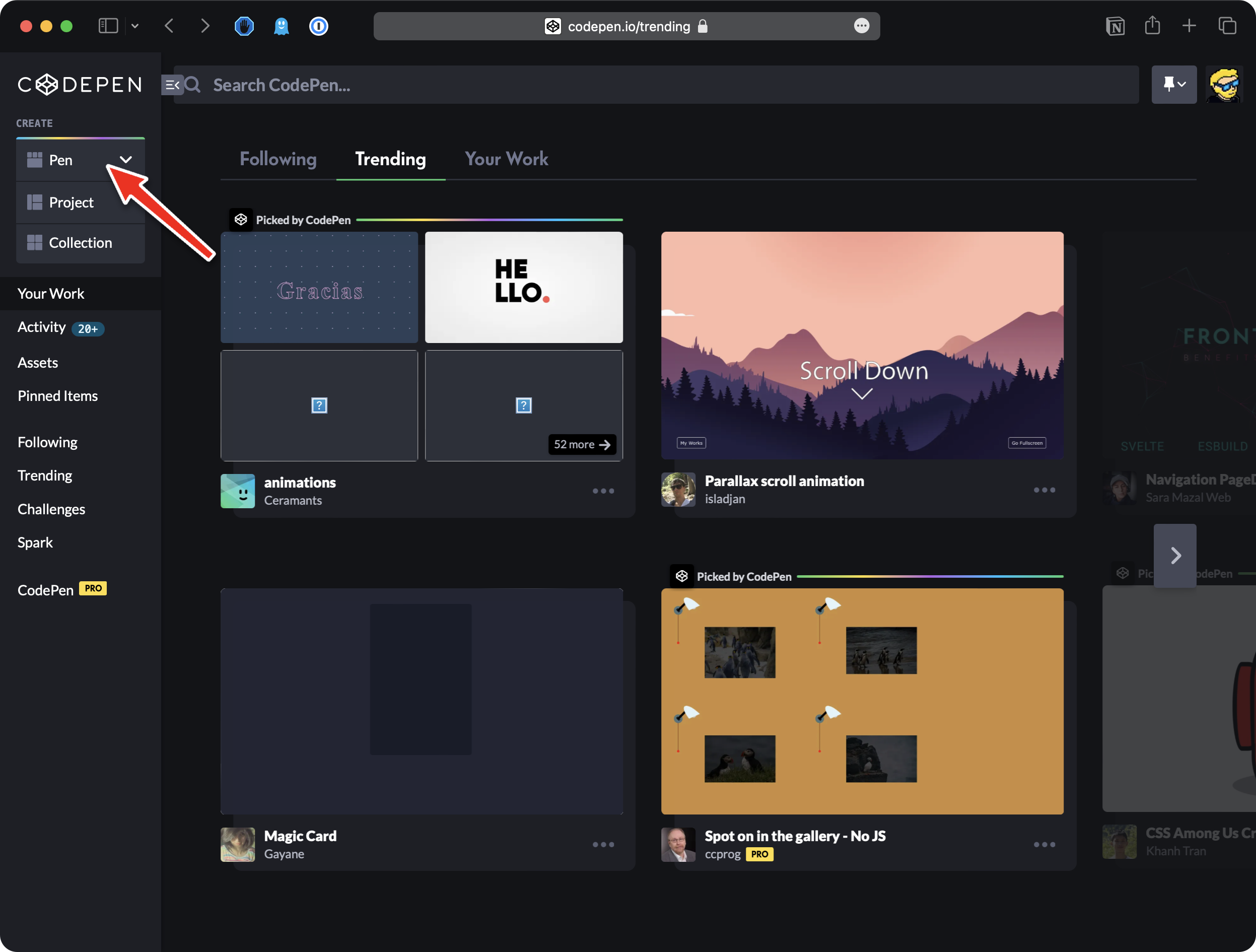
We’re going to use Codepen.
Go on Codepen and click the “Create pen” button:
This will give you a blank canvas:
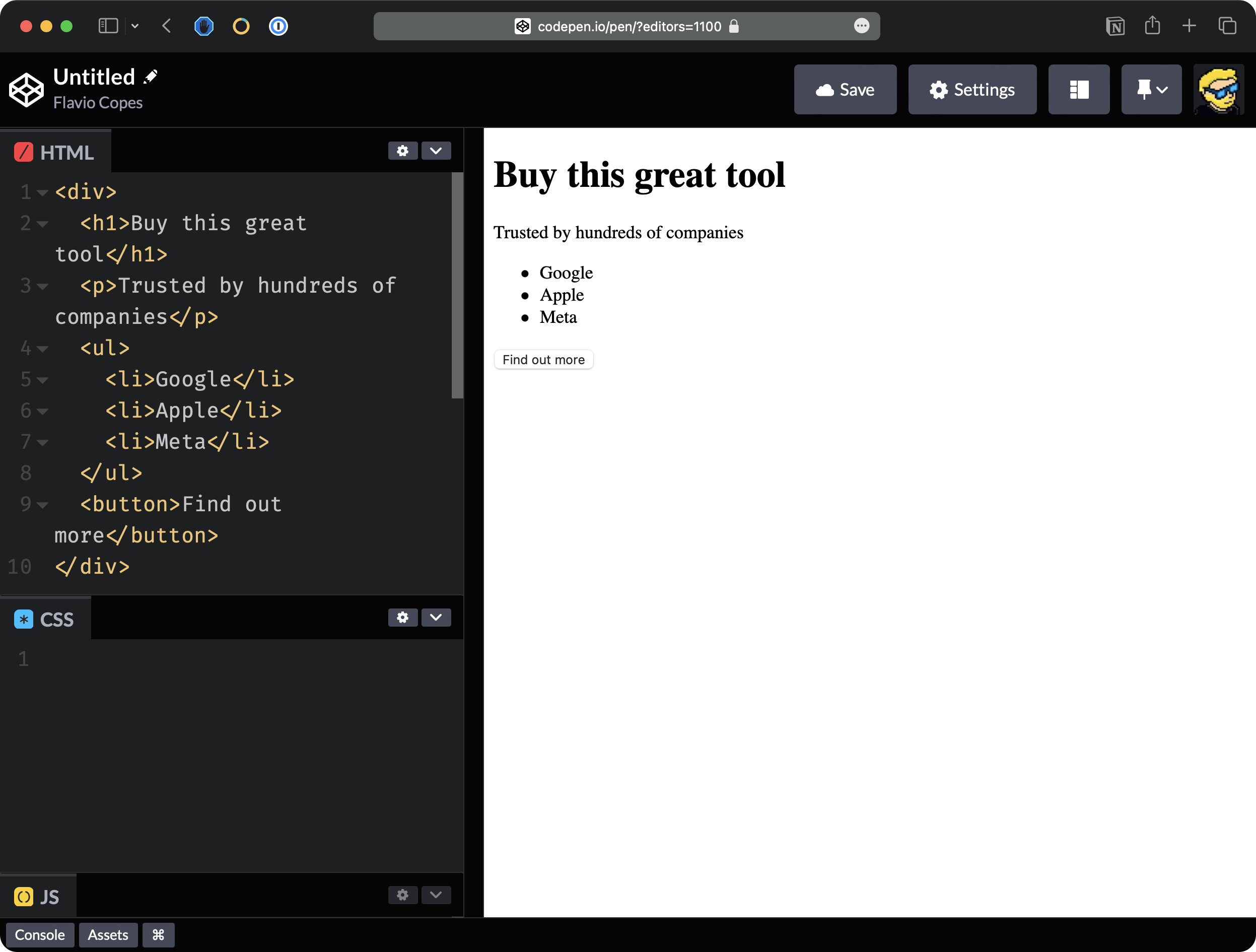
Paste in the HTML box:
<div>
  <h1>Buy this great tool</h1>
  <p>Trusted by hundreds of companies</p>
  <ul>
    <li>Google</li>
    <li>Apple</li>
    <li>Meta</li>
  </ul>
  <button>Find out more</button>
</div>
On Codepen you just paste in the HTML box the HTML that is inside the body tag, ignoring the head tag content:
Now we’ll focus on the CSS panel.
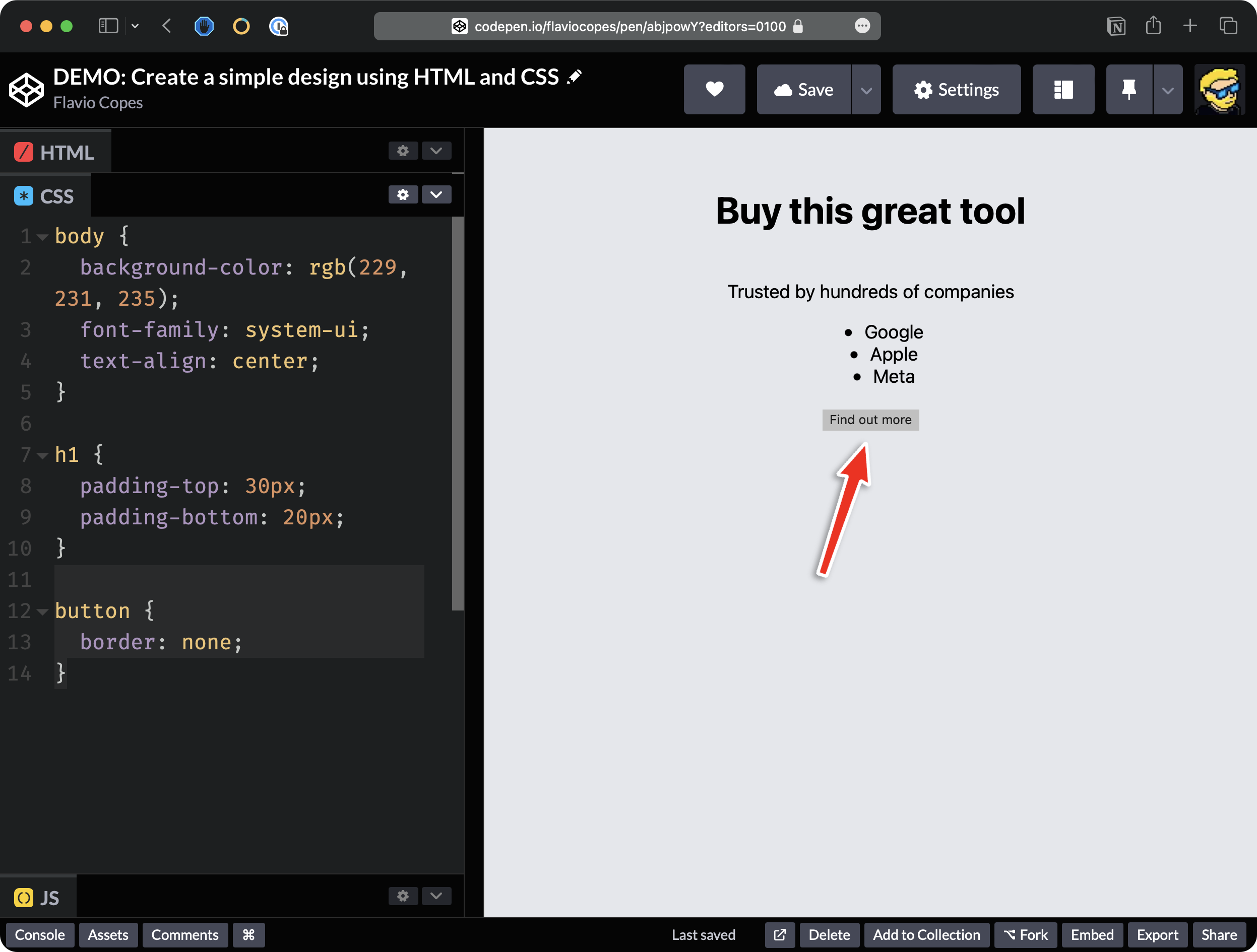
I’m going to start with setting the background. Remember that this is how we want the page to look. I’m going to immediately set the background color to use a shade of gray instead of white.
When working with CSS, we first write the selector, body in this case, because we want to apply the background to the whole body:
body {

}
and then inside the curly brackets we set some rules, in this case, background-color.
Let’s set it to gray for example:
body {
  background-color: gray;
}
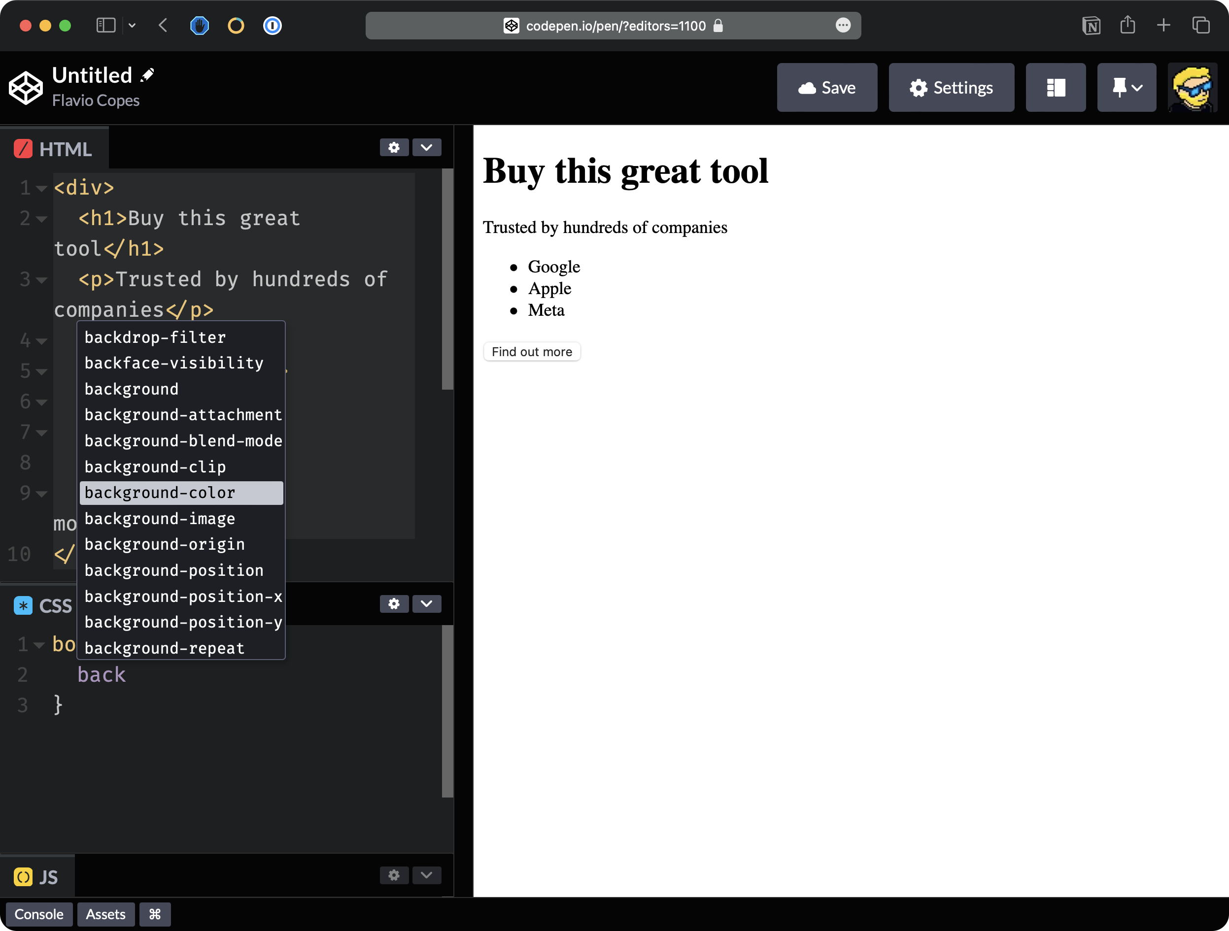
and notice that Codepen gives you some suggestions while typing, it’s pretty handy:
Here’s the result so far:
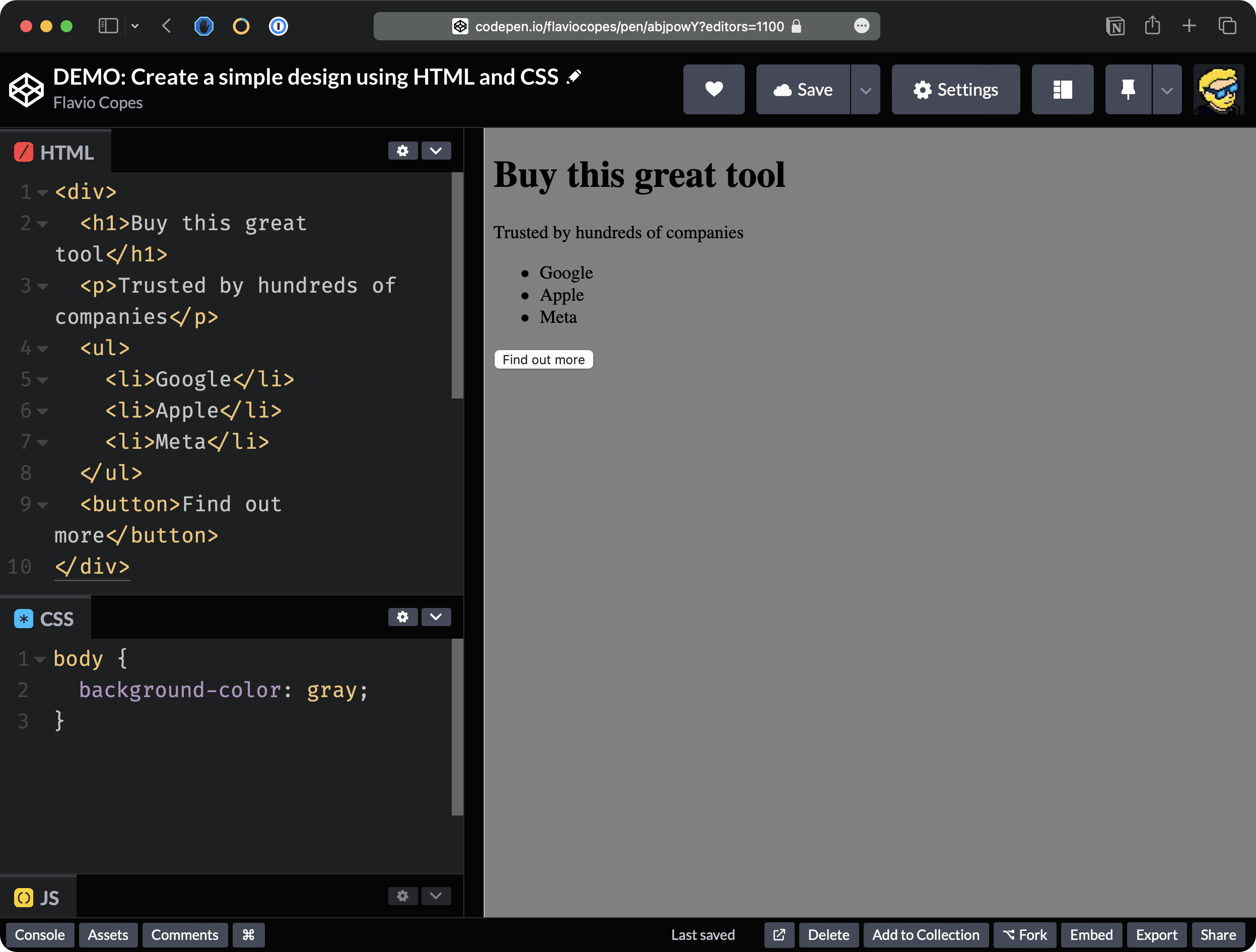
The background color has been applied on the right, as you can see
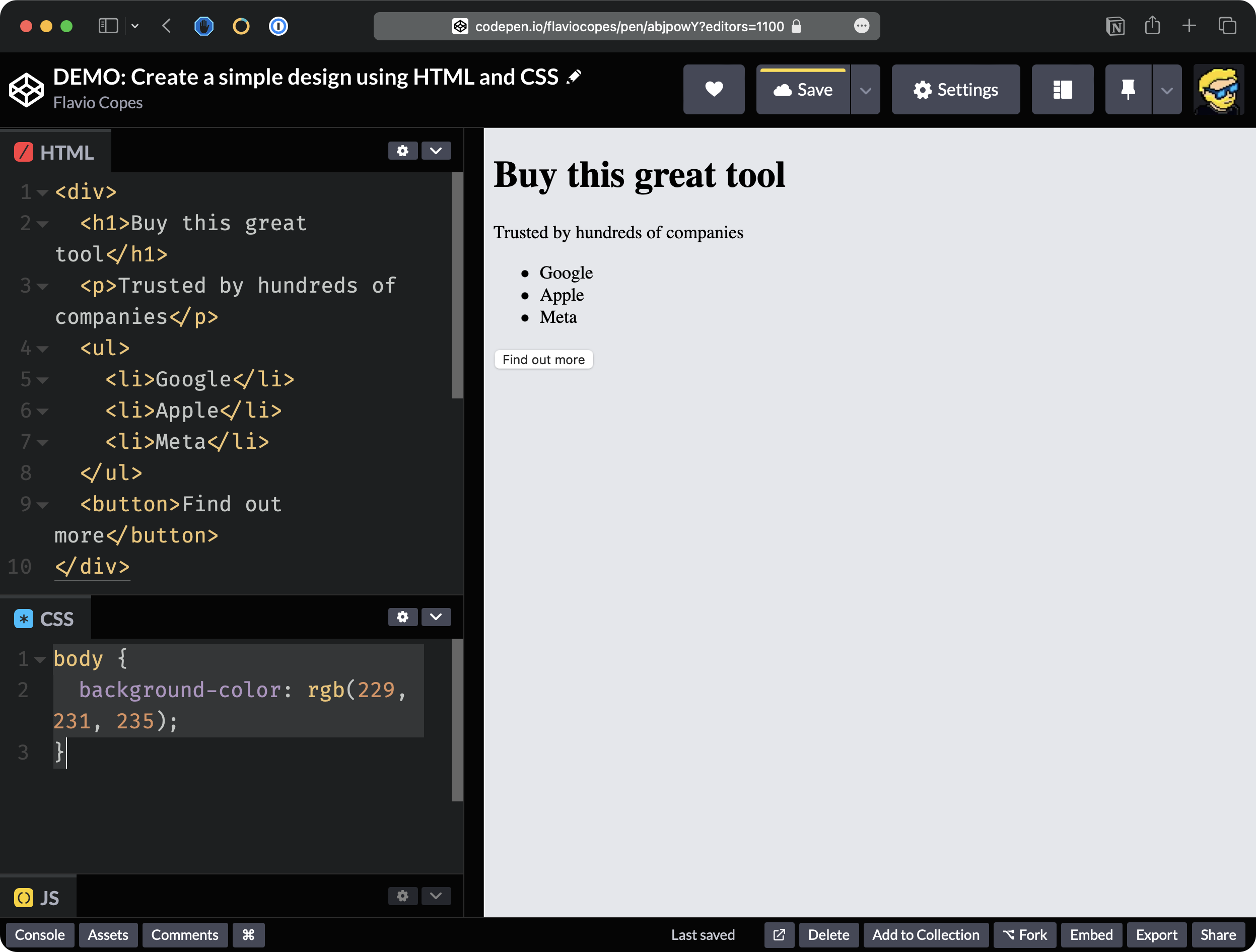
We want a lighter gray. For example, I want to use an RGB color combination as I explained in the colors lesson, like this:
body {
  background-color: rgb(229, 231, 235);
}
Much nicer:
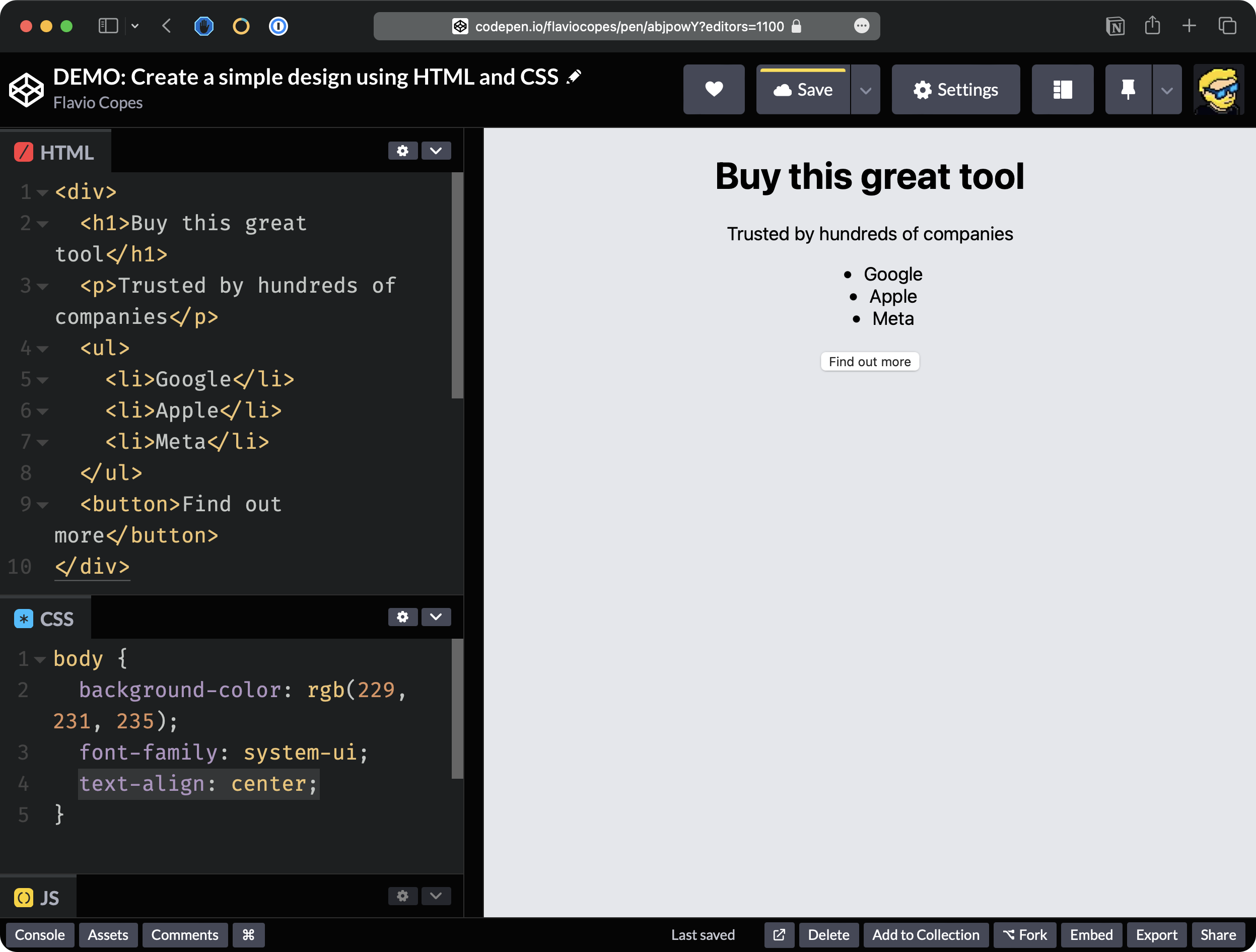
The other thing I want to do in the body is to change the family of the font. You can see that by default, the font is quite ugly so I’m going to change the font family to a particular value which is system-ui.
Using this value as you can see, things change quite a bit. The page looks nicer.
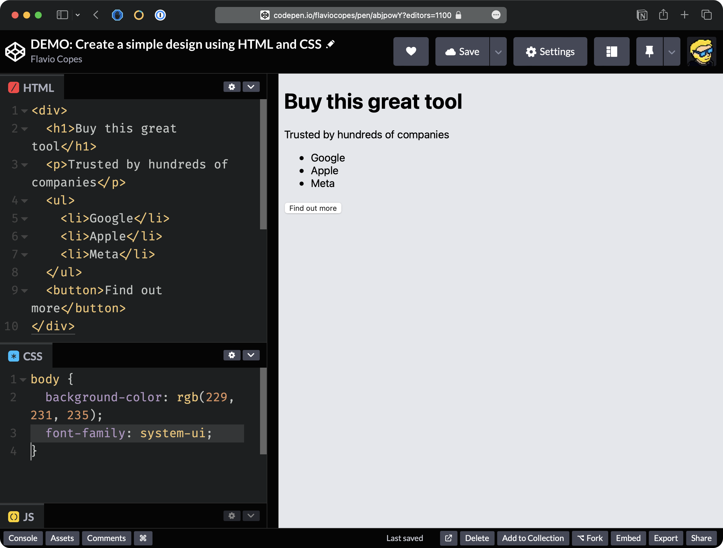
This value here sets the font to be the system default font, which will look different on different operating systems but the key thing is that it’s always a font that looks nice.
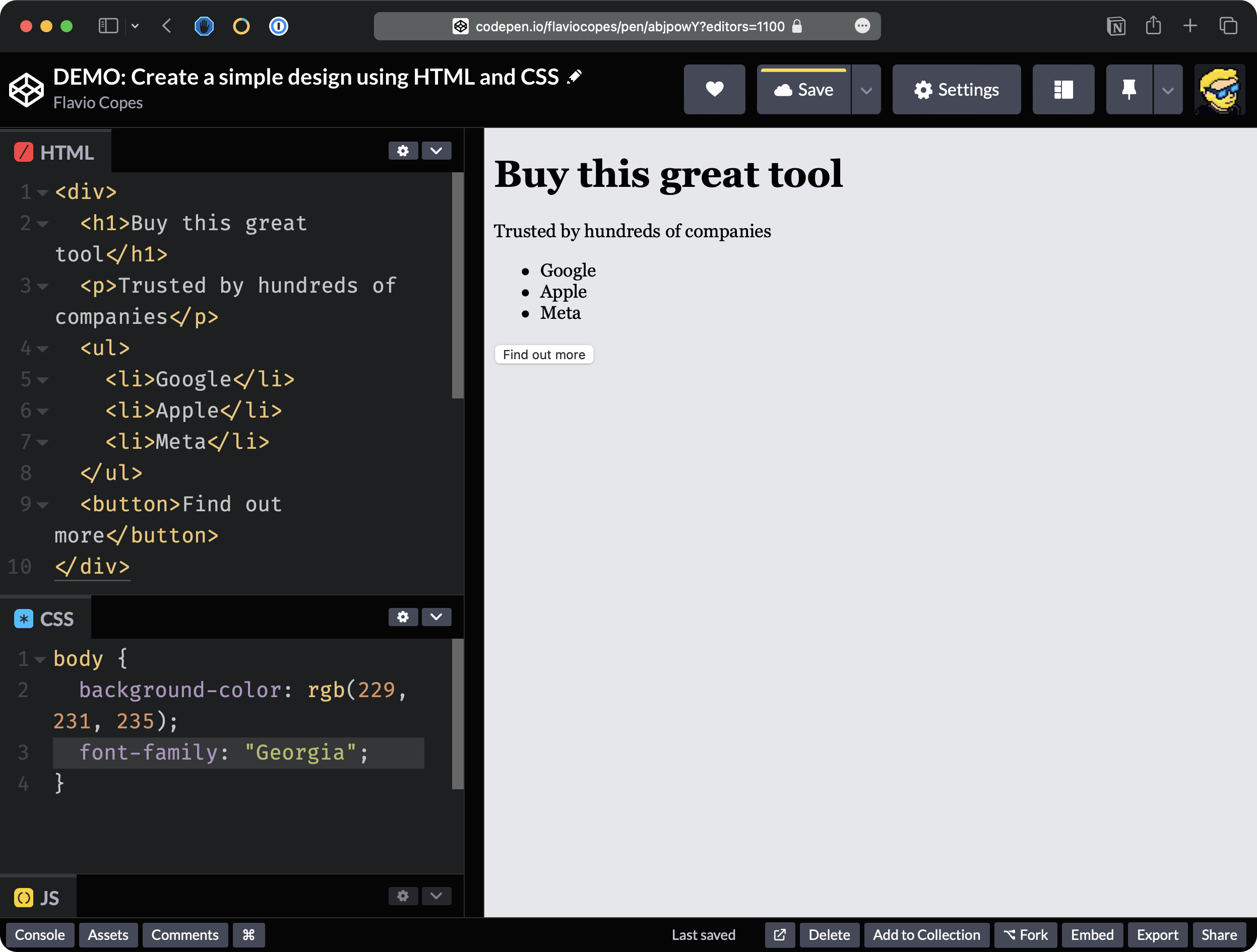
Of course, you can choose a specific font. For example font-family: "Georgia";
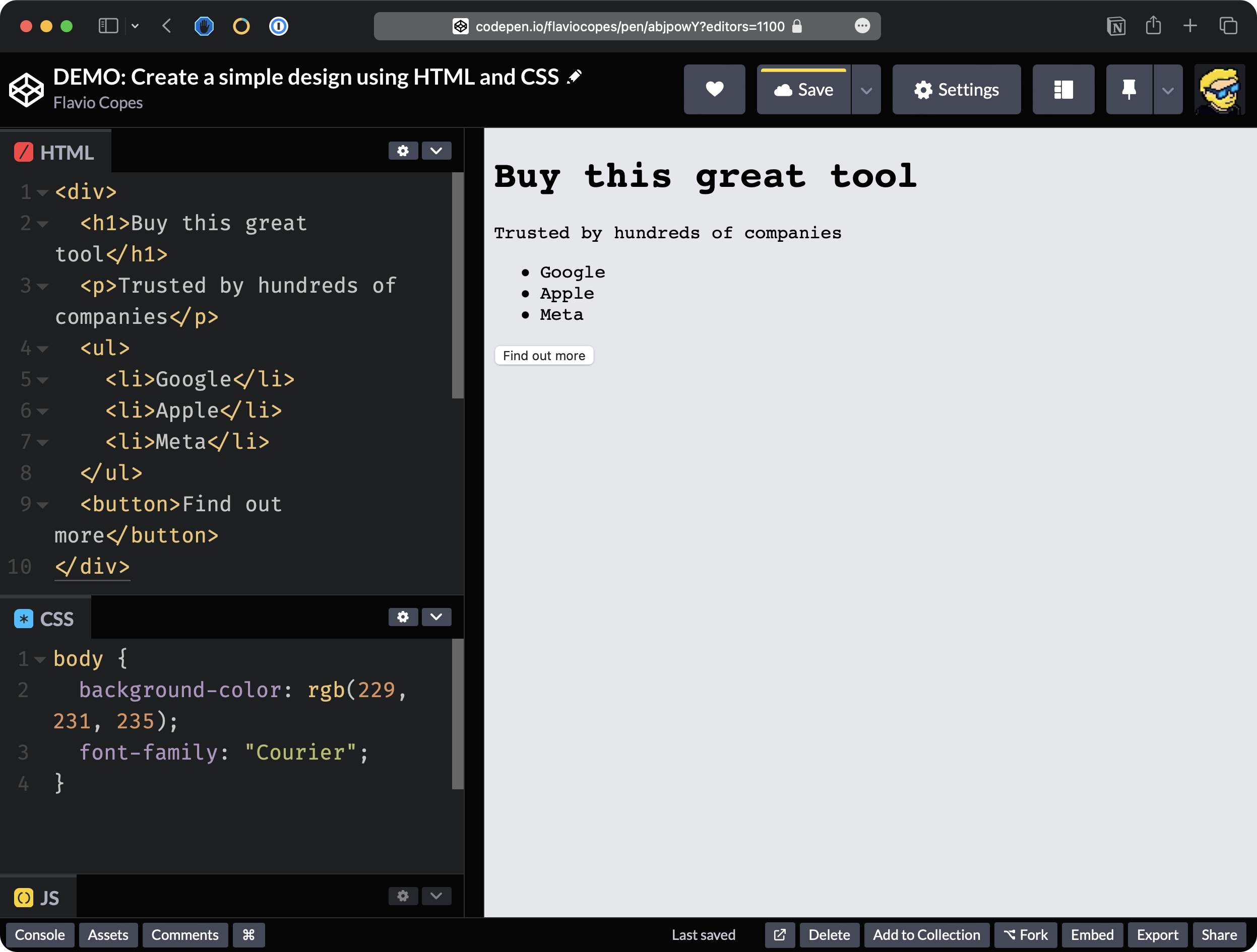
Or font-family: "Courier";
And those are just the built-in fonts. You can use any other font you like.
You can use any font you want, but for our example let’s stick to system-ui. It’s a good default.
Now I want to center everything in the middle.
Now, what I want to do here is I want to center the text in the middle.
We add text-align: center; to the body tag:
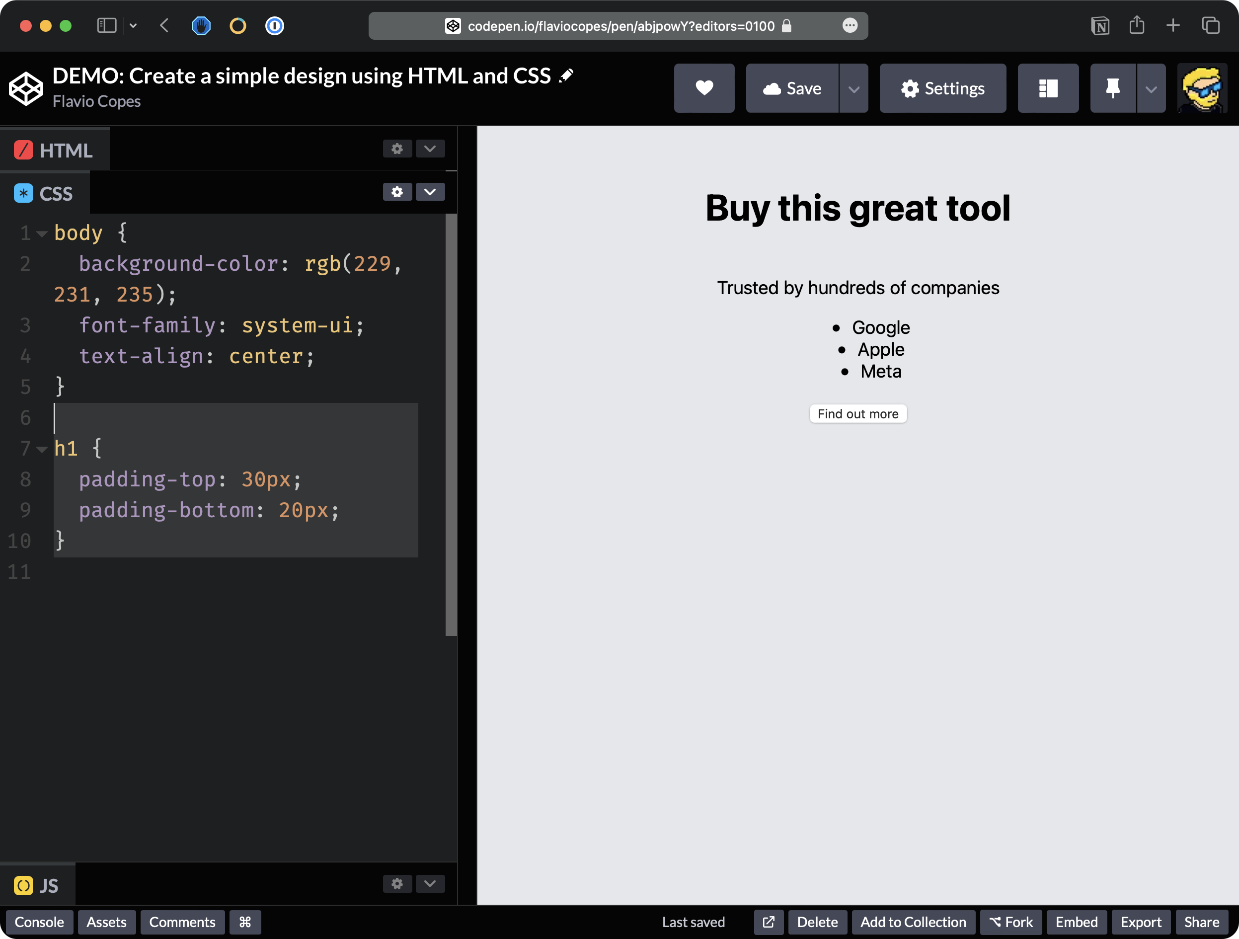
Now, we want to add some spacing to the H1 element here, the title. So we’re going to add some padding on top and some padding on the bottom so we select the H1 element.
And we say padding-top is for example 30 pixels, and padding-bottom is 20 pixels:
h1 {
  padding-top: 30px;
  padding-bottom: 20px;
}
You can see the h1 tag has more space around it:
and you can open the browser DevTools to check that we now have the padding applied:
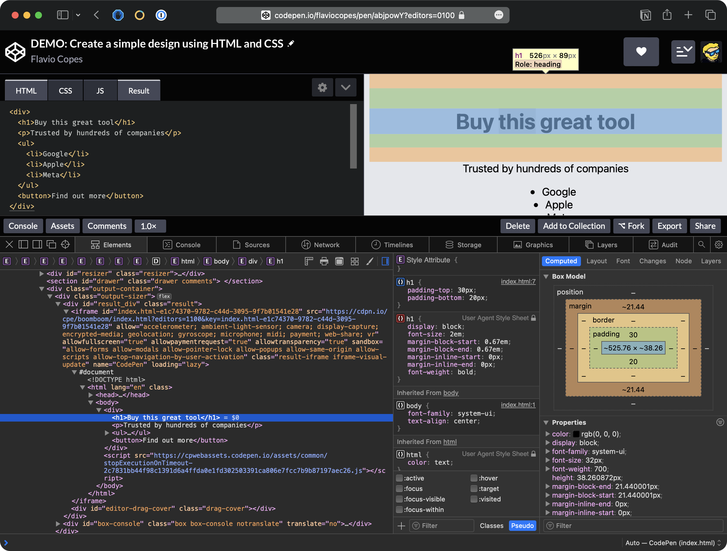
💁♂️ See the large amount of HTML on the left panel of the DevTools? That is because we have an HTML page inside another HTML page, due to us working inside Codepen. Just look at the HTML inside the
iframetag, and you’ll see the HTML you wrote inside Codepen.
Now let’s style the button.
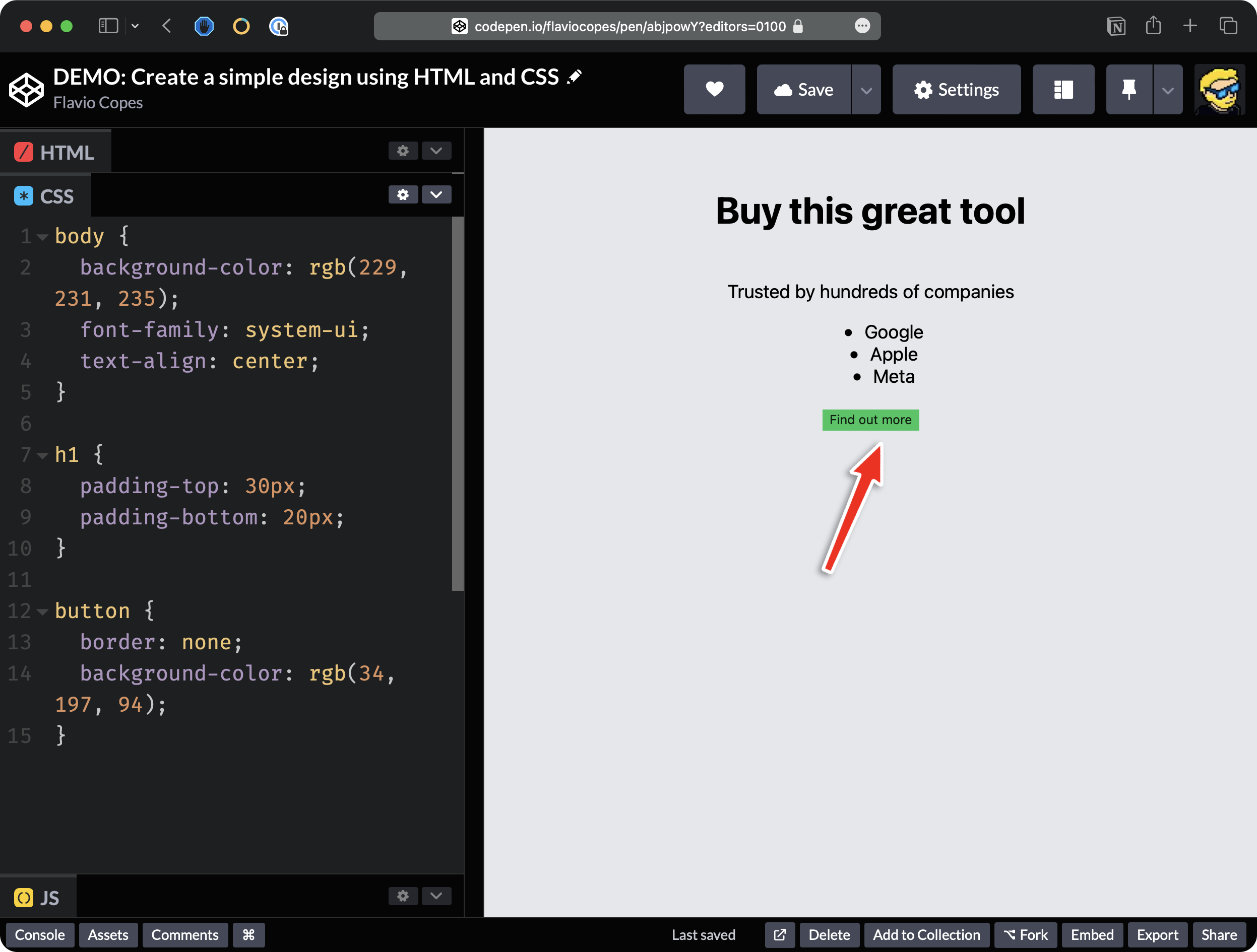
The button has some automatic styling that’s given by the browser. In particular, you can see that we have a border. We can remove the border. We select the button and we say border: none
button {
  border: none;
}
As you can see, this removes the border.
We want to apply a green background here.
So we use the background-color property and we set this to the value rgb(34, 197, 94)
Okay. We set the color of the text white and we set some padding:
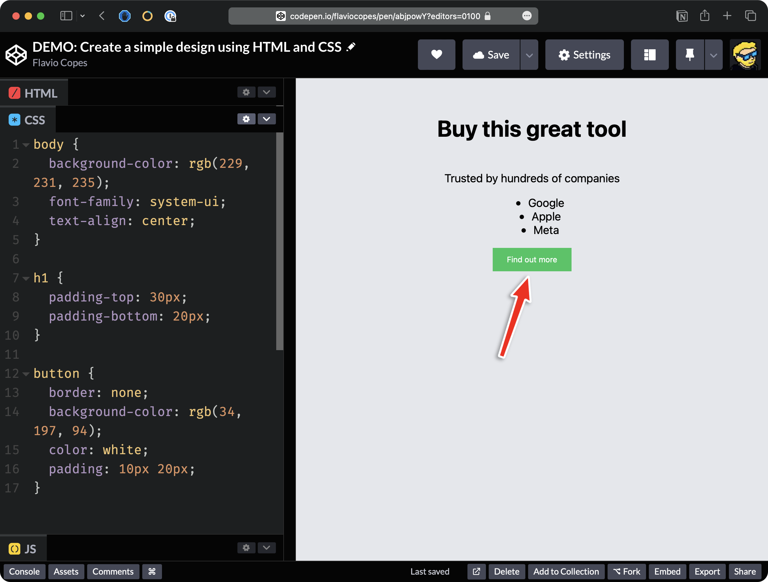
And as you can see. We applied 10 pixels vertically and 20 horizontally.
I think it’s pretty nice.
And finally, I want to uppercase the texts and we do so using text-transform passing the uppercase value.
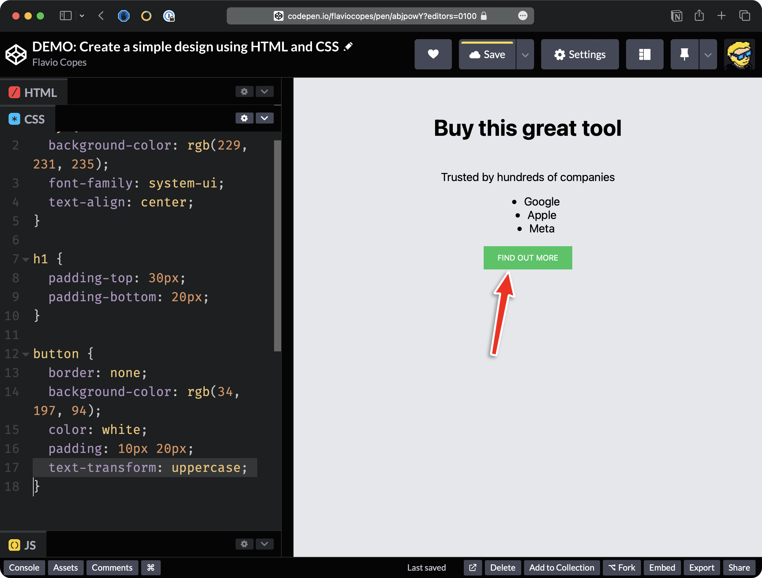
Now when I hover over this element with the mouse, I want to transform the cursor of the mouse into a pointer. So we can say cursor: pointer.
As you can see if now I move over the button we have, the cursor changes to something that says you can click this.
Okay. And I want to make the text a little bit bolder. So, I can say font-weight: bold.
All right.
button {
  border: none;
  background-color: rgb(34, 197, 94);
  color: white;
  padding: 10px 20px;
  text-transform: uppercase;
  cursor: pointer;
  font-weight: bold;
}
Now we need to style those companies’ names.
We want to display them with a gray font, so we add
li {
  color: gray
}
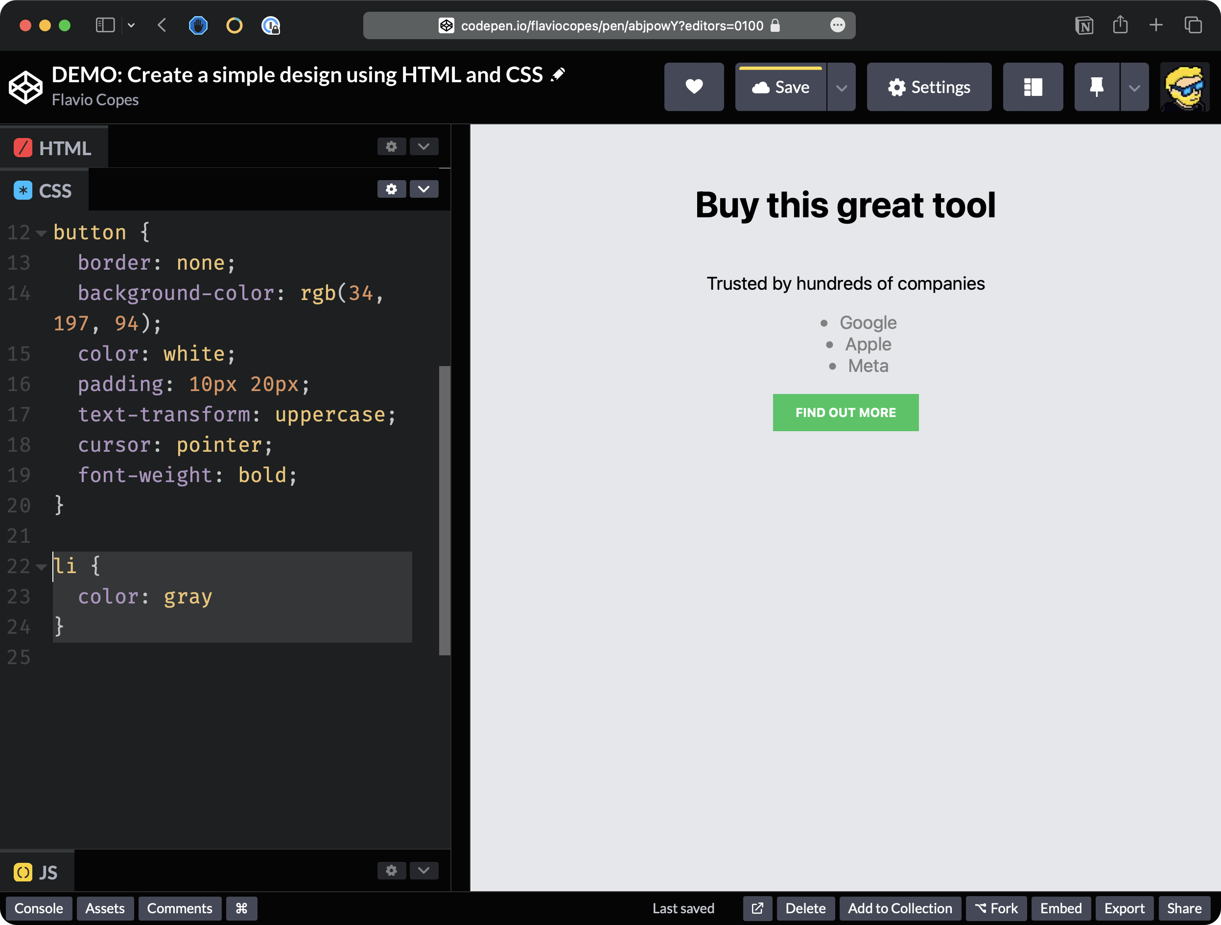
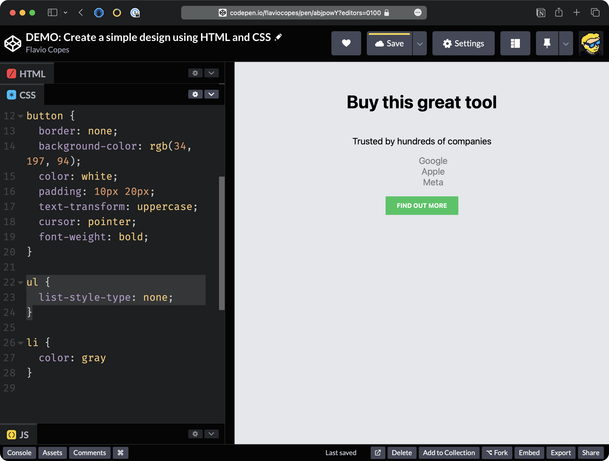
We also want to remove the “dot” of the list which is added automatically by the browser because this is a list of items.
To do so we add
ul {
  list-style-type: none;
}
Now, if you inspect this, now you can see that the UL element has some padding applied by the browser.
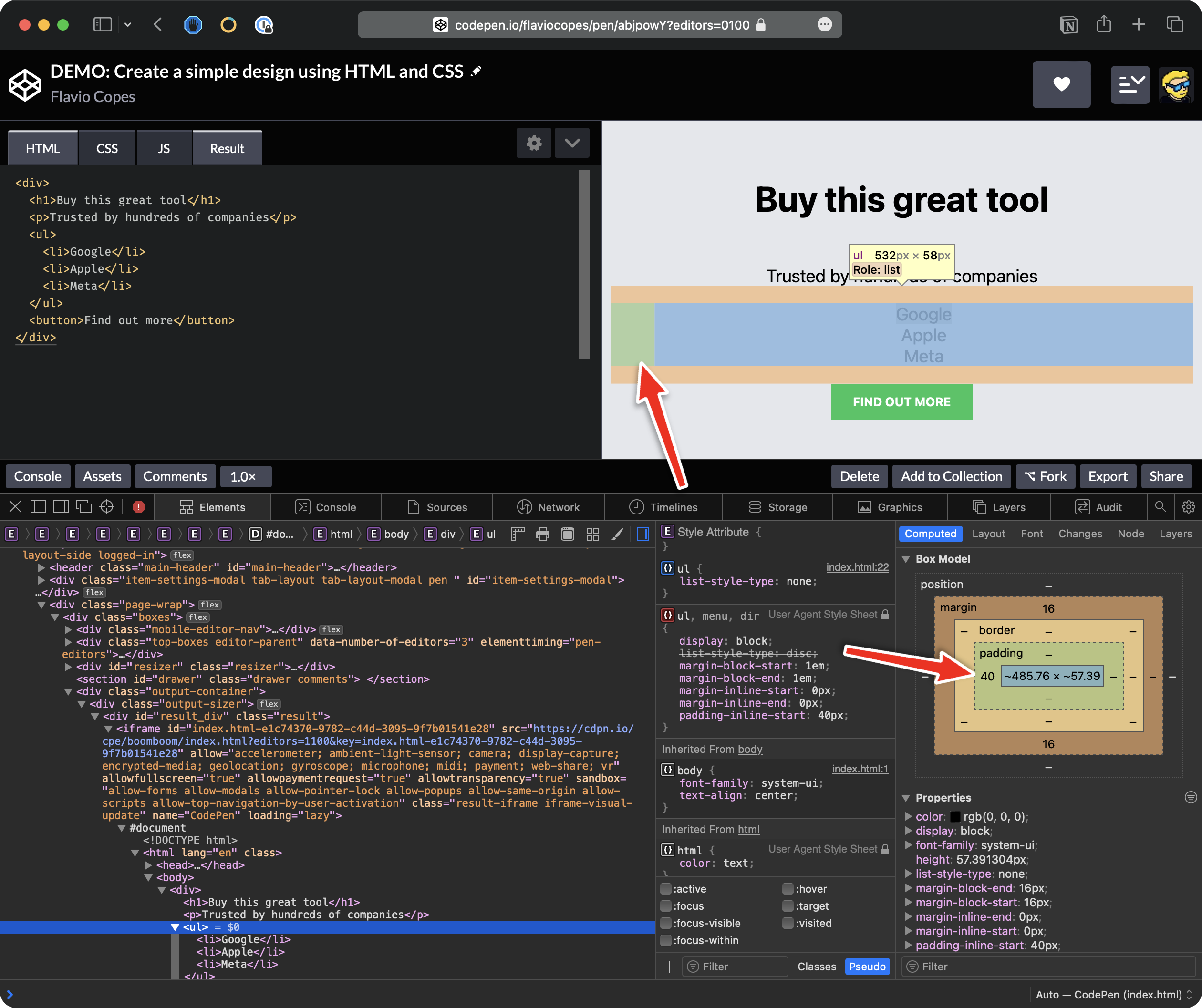
This is because there is this property which is introduced by the user agent style sheet (the default browser’s CSS rules:
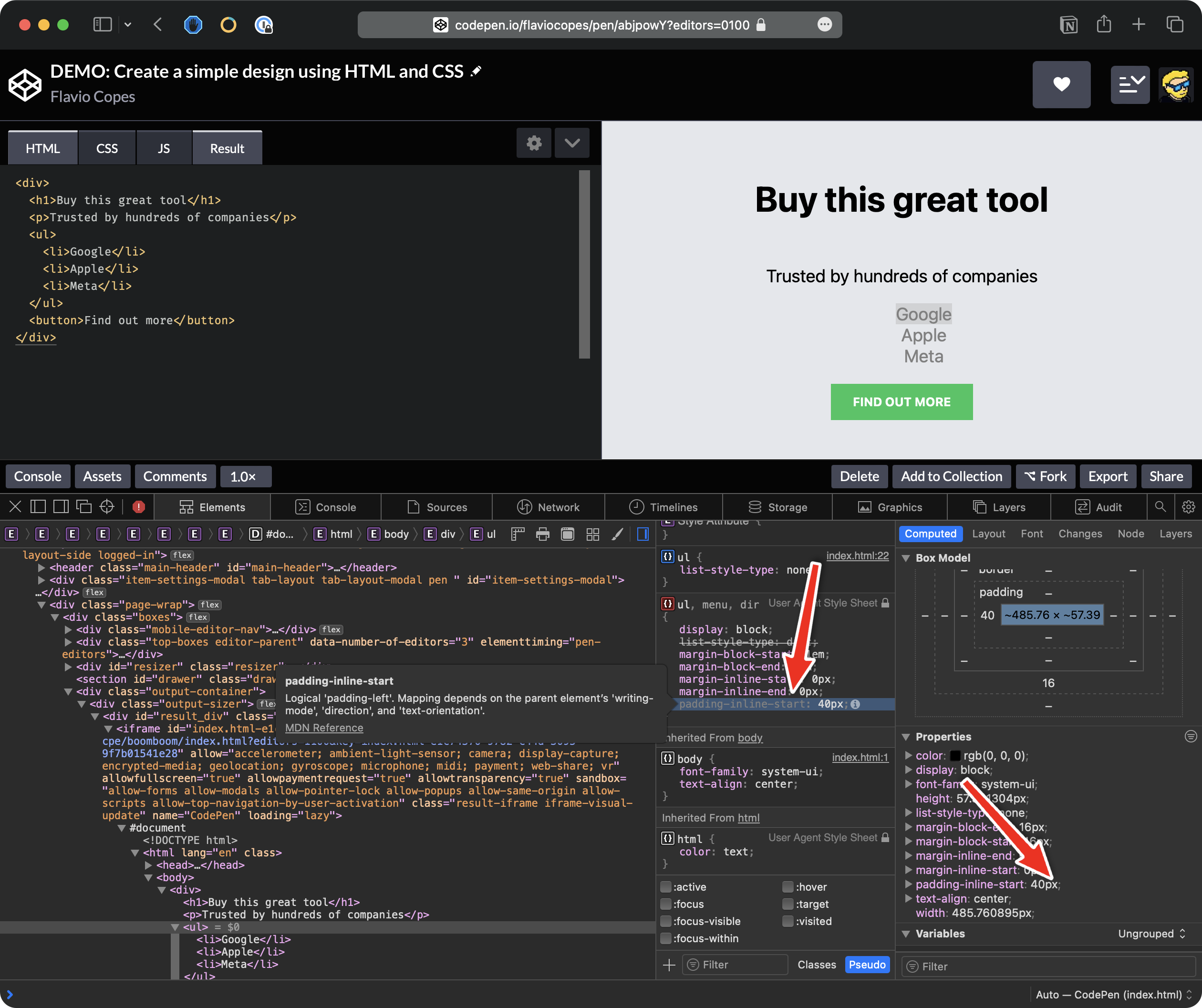
So what I’m going to do now here is I’m going to say:
ul {
  padding: 0;
}
so we remove all the padding introduced by the browser.
So now the elements as you can see are perfectly centered in the middle.
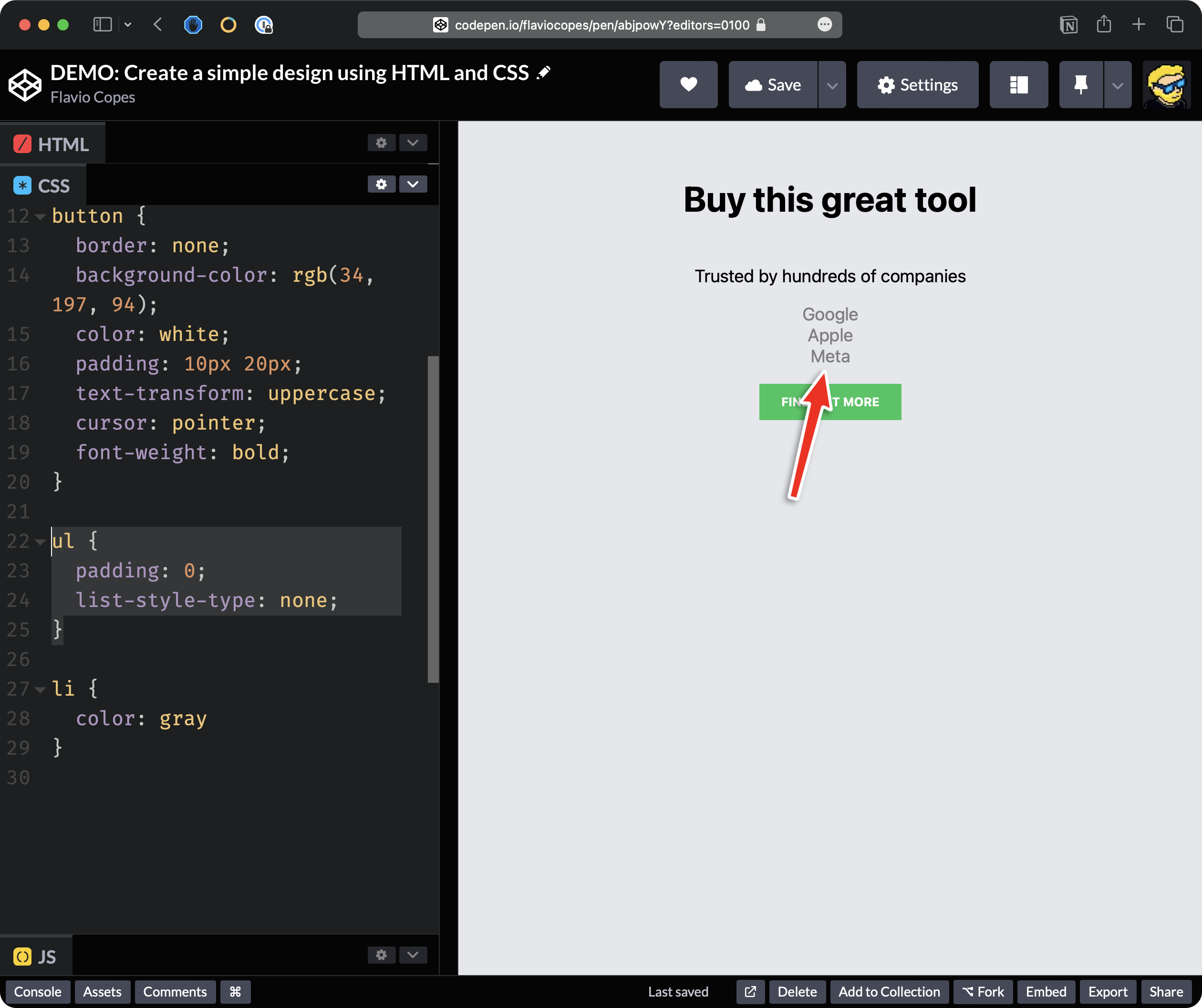
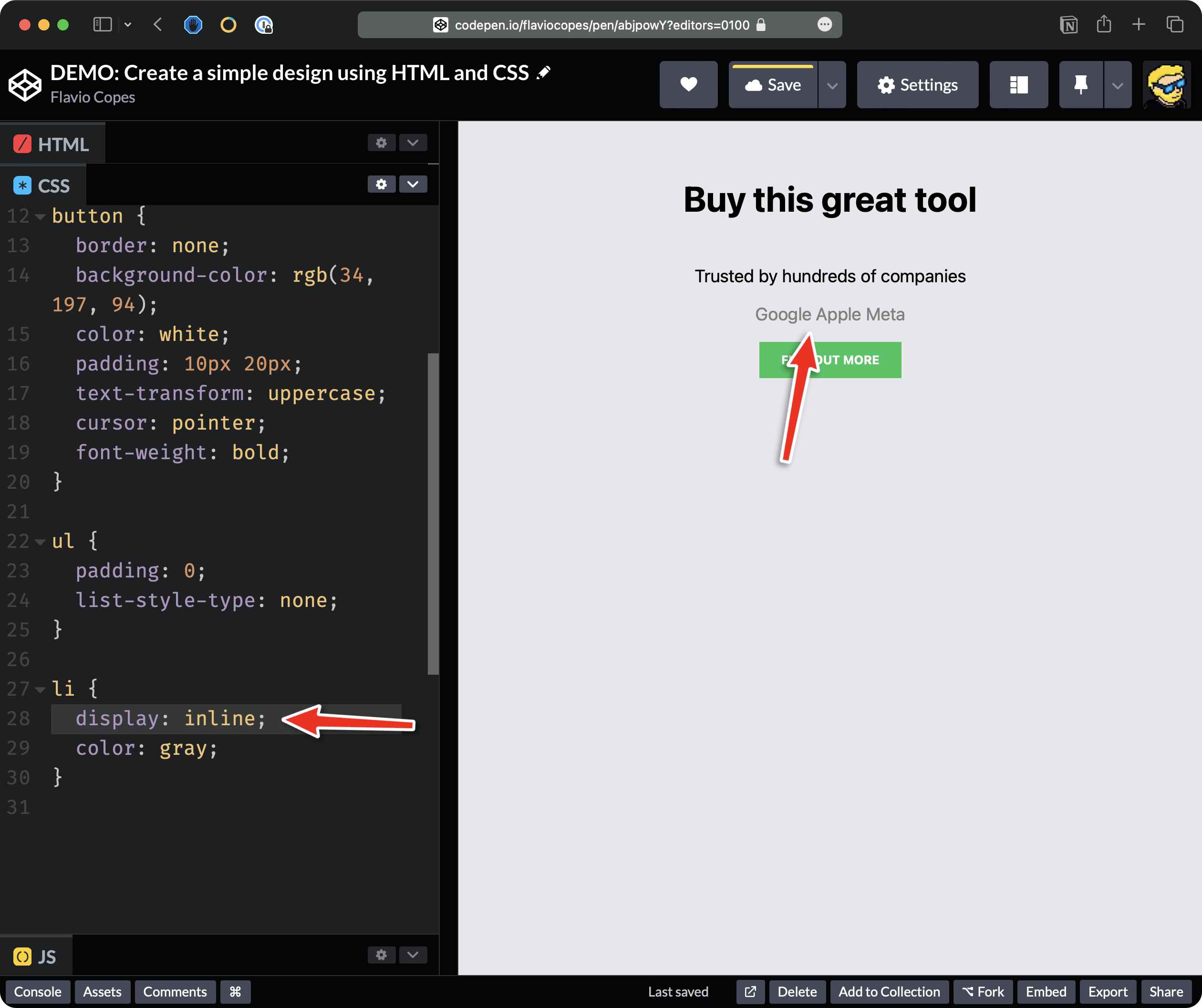
But, we want elements to be displayed horizontally, not vertically.
To do that we must change how the list items are displayed, by setting the display property which by default is block because this is a block element. And we set this to inline.
So now you can see that the elements are displayed horizontally.
Now we are missing some space vertically so I’m going to change this line padding: 0 to padding: 20px 0; to add 20px of padding vertically and 0 horizontally.
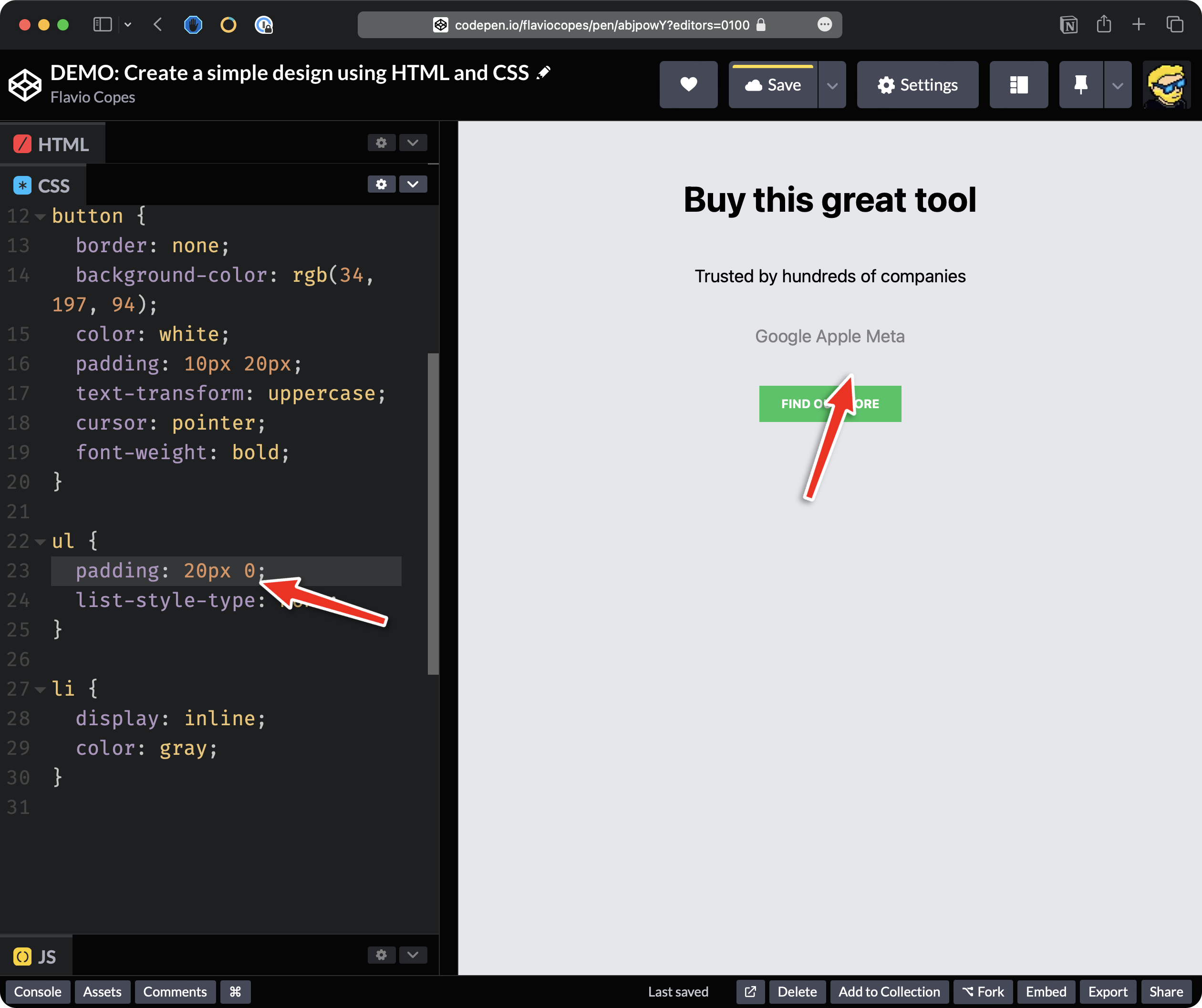
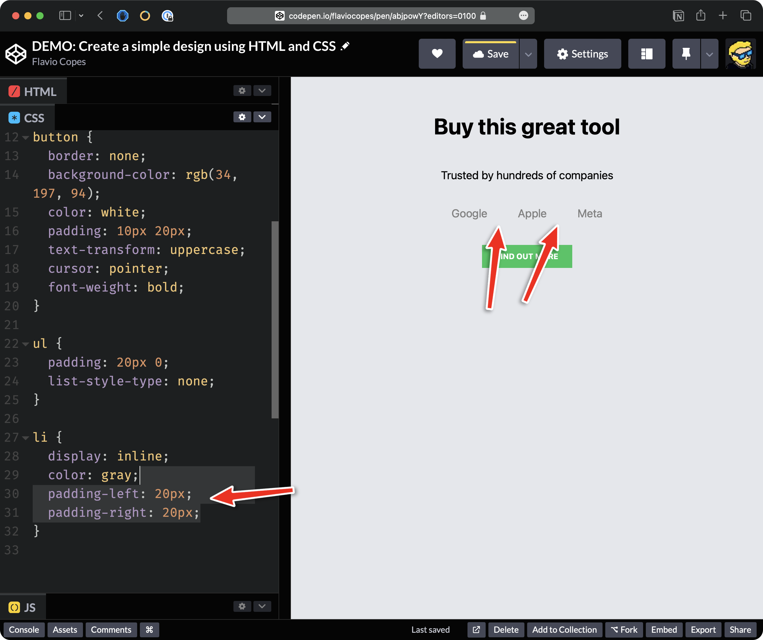
Finally, we add some horizontal padding to the list of items, to make them better spaced out:
li {
  padding-left: 20px;
  padding-right: 20px;
}
Here’s the full code of this demo on Codepen.
See the Pen Form events demo by Flavio Copes (@flaviocopes) on CodePen.
Lessons in this unit:
| 0: | Introduction |
| 1: | Colors |
| 2: | More selectors |
| 3: | Cascade |
| 4: | Specificity |
| 5: | Units |
| 6: | Advanced selectors |
| 7: | Typography |
| 8: | The box model |
| 9: | The display property |
| 10: | Responsive design |
| 11: | ▶︎ DEMO Create a simple design |