CSS Grid: grid-template-columns and grid-template-rows

Those properties define the number of columns and rows in the grid, and they also set the width of each column/row.

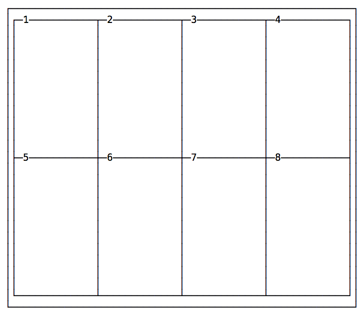
The following snippet defines a grid with 4 columns each 200px wide, and 2 rows with a 300px height each.

.container {
  display: grid;
  grid-template-columns: 200px 200px 200px 200px;
  grid-template-rows: 300px 300px;
}

A grid with 4 columns and 2 rows

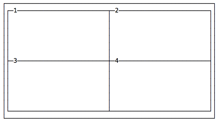
Here’s another example of a grid with 2 columns and 2 rows:

.container {
  display: grid;
  grid-template-columns: 200px 200px;
  grid-template-rows: 100px 100px;
}

A grid with 2 columns and 2 rows

Lessons in this unit:

0: Introduction
1: ▶︎ grid-template-columns and grid-template-rows
2: Setting columns and rows dimensions
3: Gap between the cells
4: Span items on multiple columns and/or rows
5: Minimum row width
6: Layout using grid-template-areas
7: DEMO Example: simple grid layout
8: DEMO Example: grid layout with header, sidebar, content and footer