Many times you might have a fixed header size, a fixed footer size, and the main content that is flexible in height, depending on its length. In this case you can use the auto keyword:
.container {
  display: grid;
  grid-template-rows: 100px auto 100px;
}
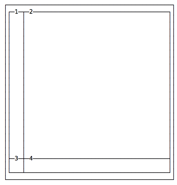
In this example we made pretty, regular grids by using the same values for rows and the same values for columns:
.container {
  display: grid;
  grid-template-columns: 200px 200px;
  grid-template-rows: 100px 100px;
}
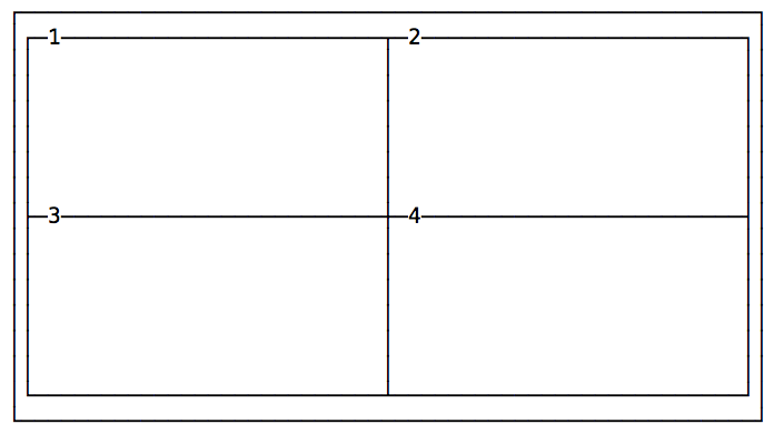
You can specify different values for each row/column, to create a lot of different designs:
.container {
  display: grid;
  grid-template-columns: 100px 200px;
  grid-template-rows: 100px 50px;
}
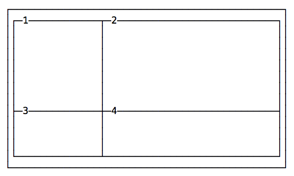
Another example:
.container {
  display: grid;
  grid-template-columns: 10px 100px;
  grid-template-rows: 100px 10px;
}
Using fractions, percentages and rem
Specifying the exact width of each column or row is not ideal in every case.
A fraction is a unit of space.
The following example divides a grid into 3 columns with the same width, 1/3 of the available space each.
.container {
  grid-template-columns: 1fr 1fr 1fr;
}
You can also use percentages, and mix and match fractions, pixels, rem and percentages:
.container {
  grid-template-columns: 3rem 15% 1fr 2fr
}
Using repeat()
repeat() is a special function that takes a number that indicates the number of times a row/column will be repeated, and the length of each one.
If every column has the same width you can specify the layout using this syntax:
.container {
  grid-template-columns: repeat(4, 100px);
}
This creates 4 columns with the same width.
Or using fractions:
.container {
  grid-template-columns: repeat(4, 1fr);
}