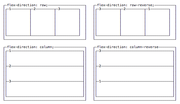
The first property we see, flex-direction, determines if the container should align its items as rows, or as columns:
flex-direction: rowplaces items as a row, in the text direction (left-to-right for western countries)flex-direction: row-reverseplaces items just likerowbut in the opposite directionflex-direction: columnplaces items in a column, ordering top to bottomflex-direction: column-reverseplaces items in a column, just likecolumnbut in the opposite direction