In this demo, I’m going to do a demo of flexbox, showing the concepts explained in the previous lessons.
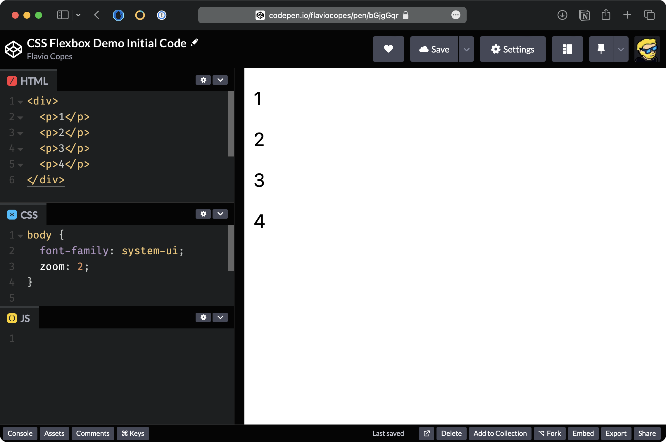
Let’s start with a simple Codepen as we did for the CSS Grid demo.
We have a div wrapper element with 4 paragraph tags inside it:
Like in the CSS Grid demo, let’s start by adding some basic styling, giving the elements a border and color, and removing the default margin:
p {
  border: 1px solid;
  padding: 20px;
  margin: 0;
  text-align: center;
  background-color: yellow;
}
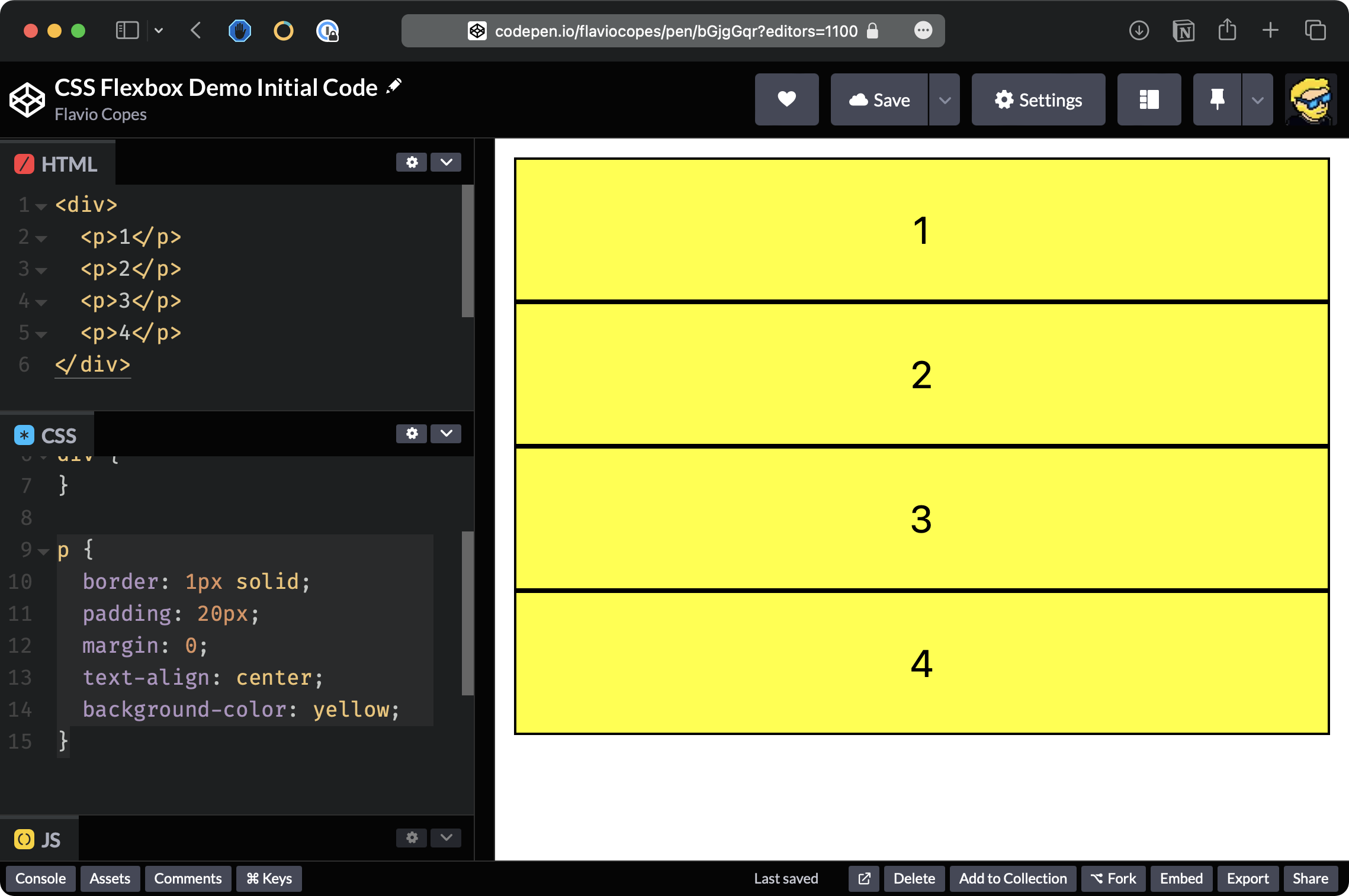
So this is like the starting CSS we had in the CSS Grid demo.
But this time we are going to experiment with Flexbox, so enable Flexbox using display: flex on the container div element:
div {
  display: flex;
}
Now you’ll see that the p elements are displayed in a single row, in order:
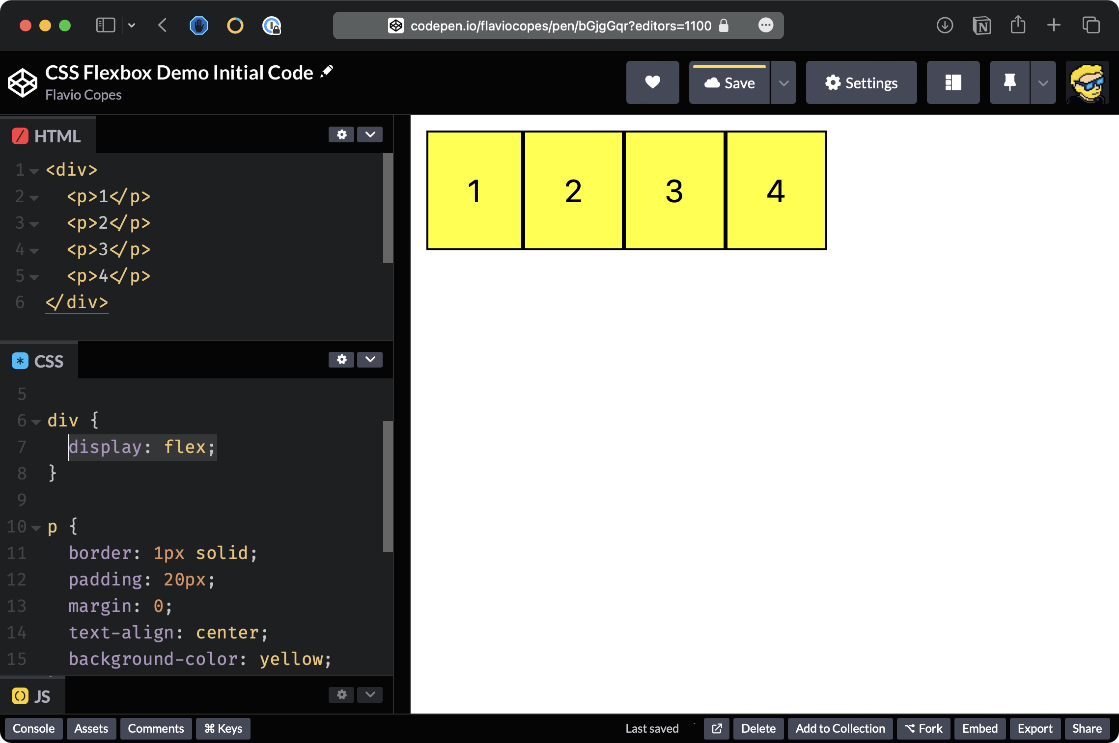
This is the default behavior of display: flex.
We can say, instead of having items placed in a row, we want them to be placed in a column.
And to do so we say flex-direction: column.
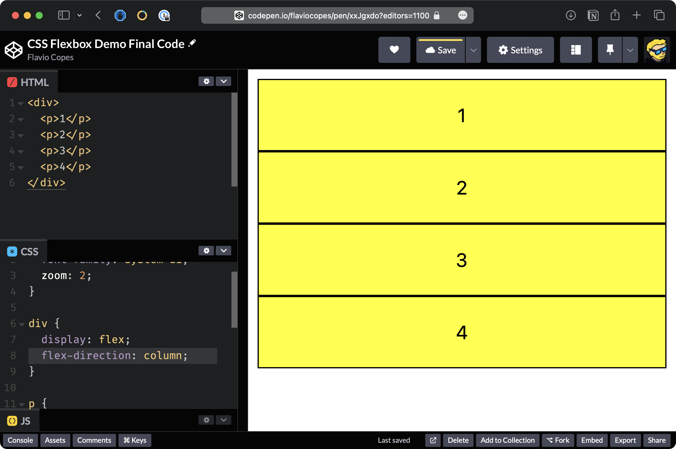
You can see that elements are displayed basically like before when we didn’t have any Flexbox applied to the div.
But now we have a lot more flexibility. For example, we can reverse the order using flex-direction: column-reverse
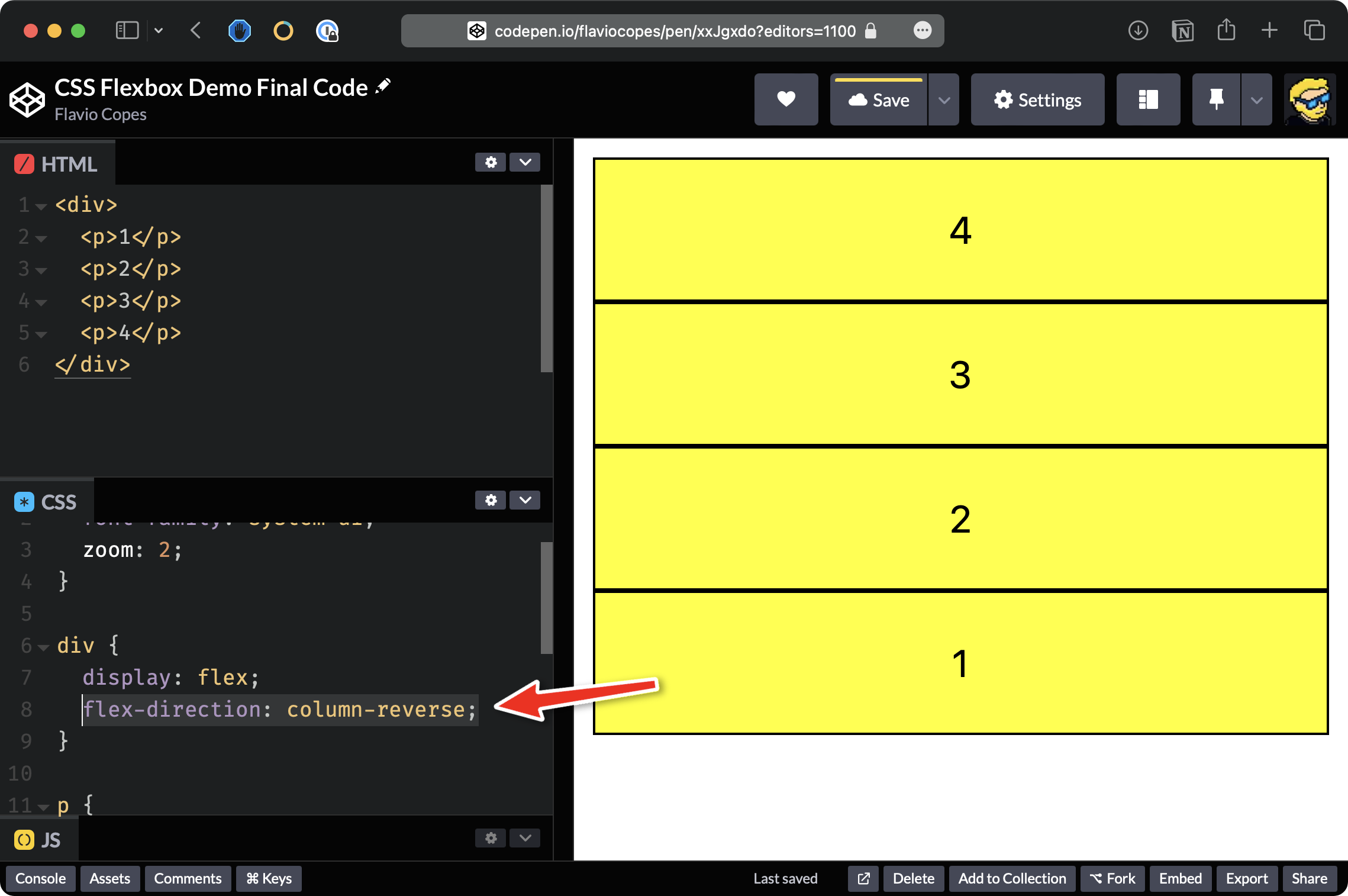
The last item now is displayed first.
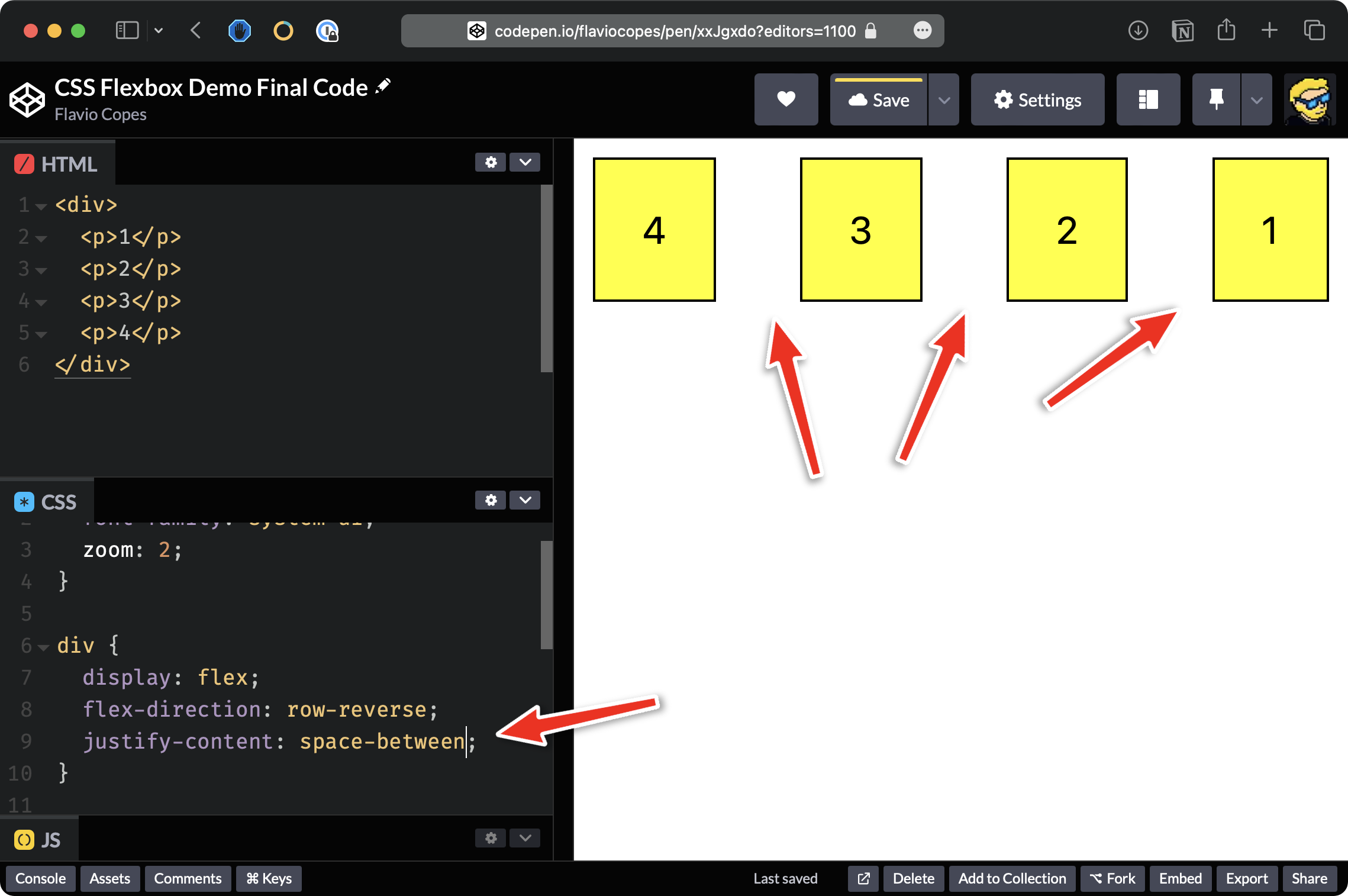
We can also use row-reverse and in this case, as you can see, we have 4-3-2-1 in a single row:
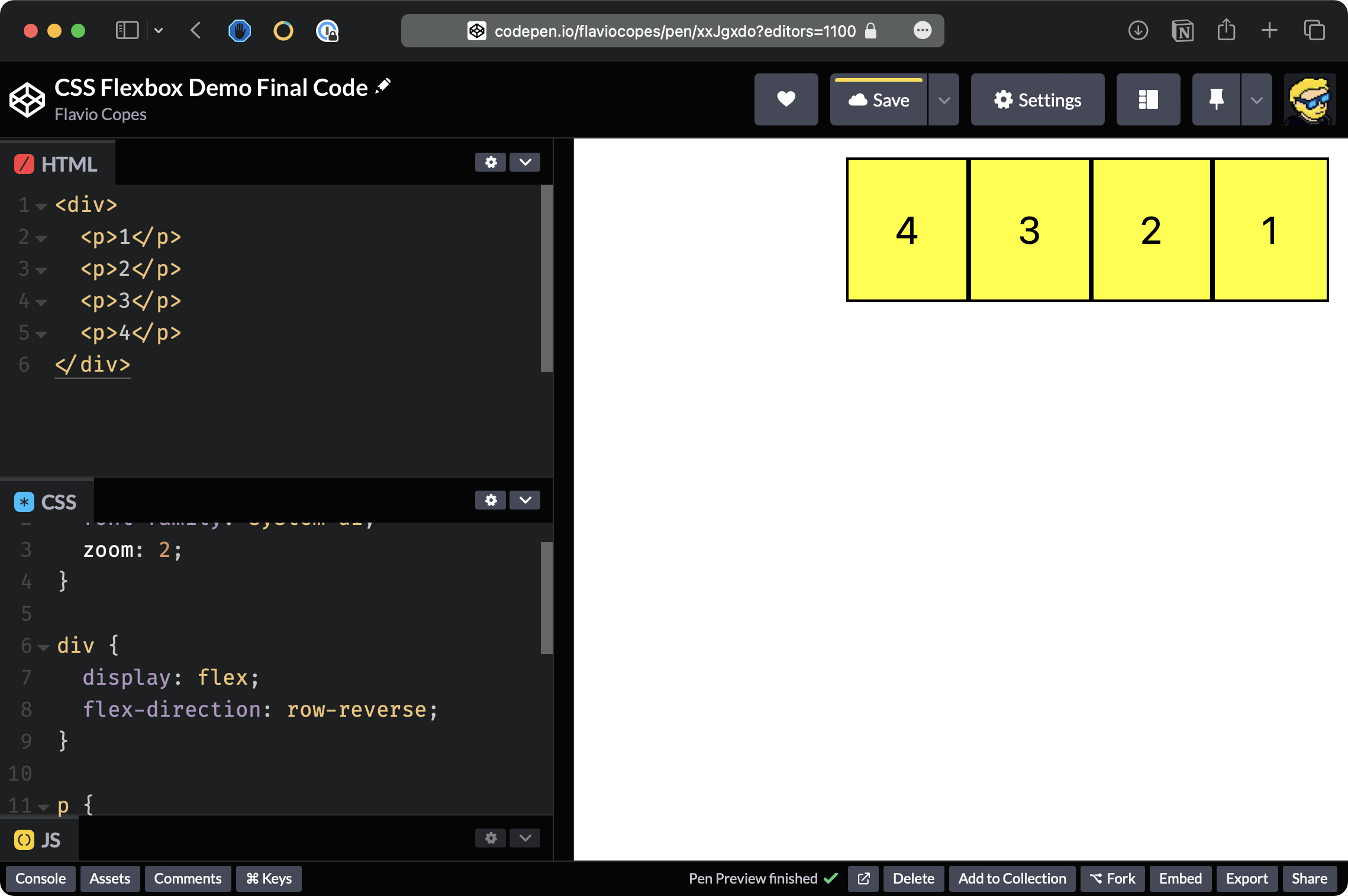
Now elements are displayed on the right side of the container, which is taking the full width of the page.
We can tell Flexbox to start on the left instead using justify-content: start:
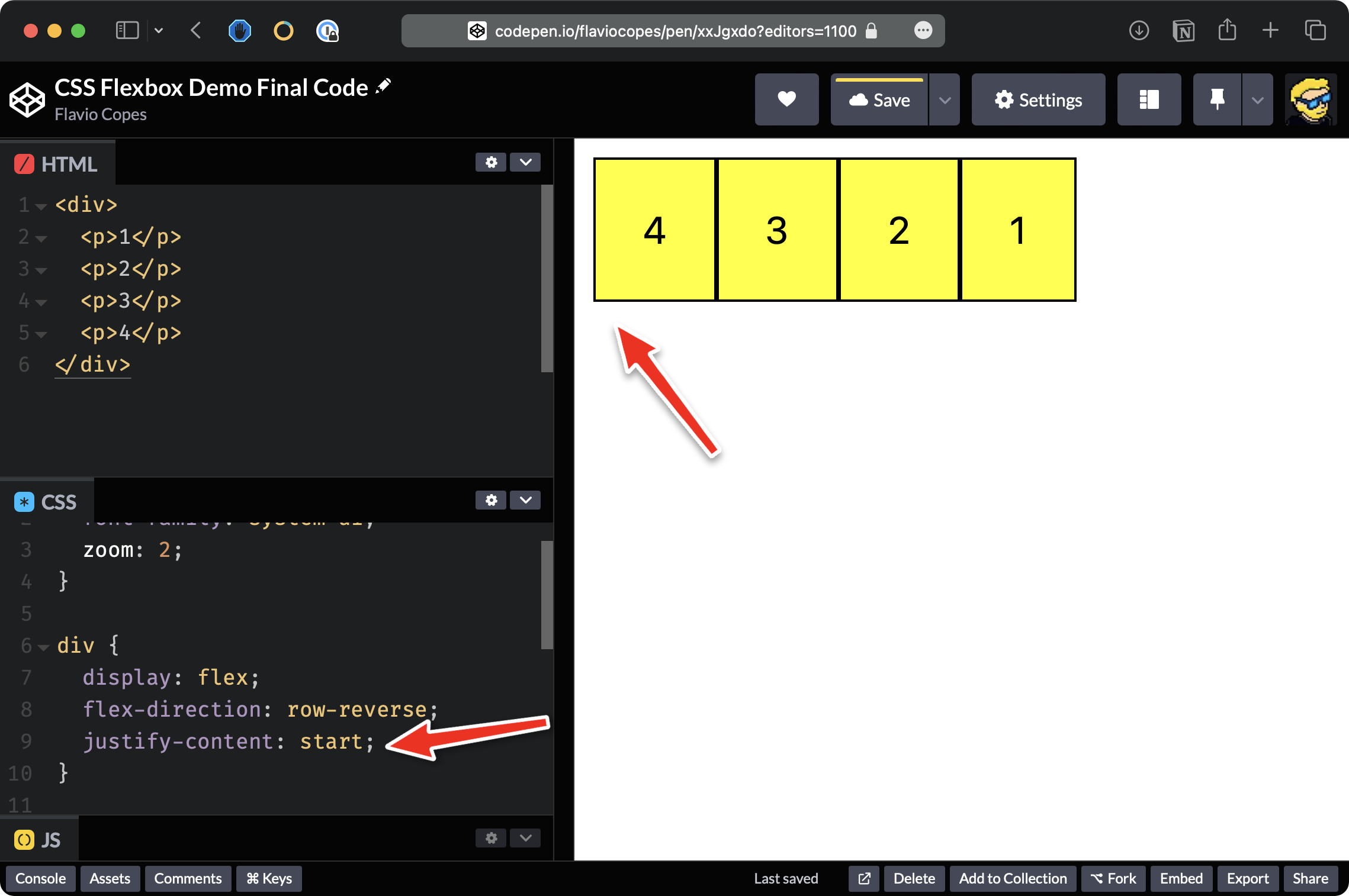
justify-content: left works in the same way.
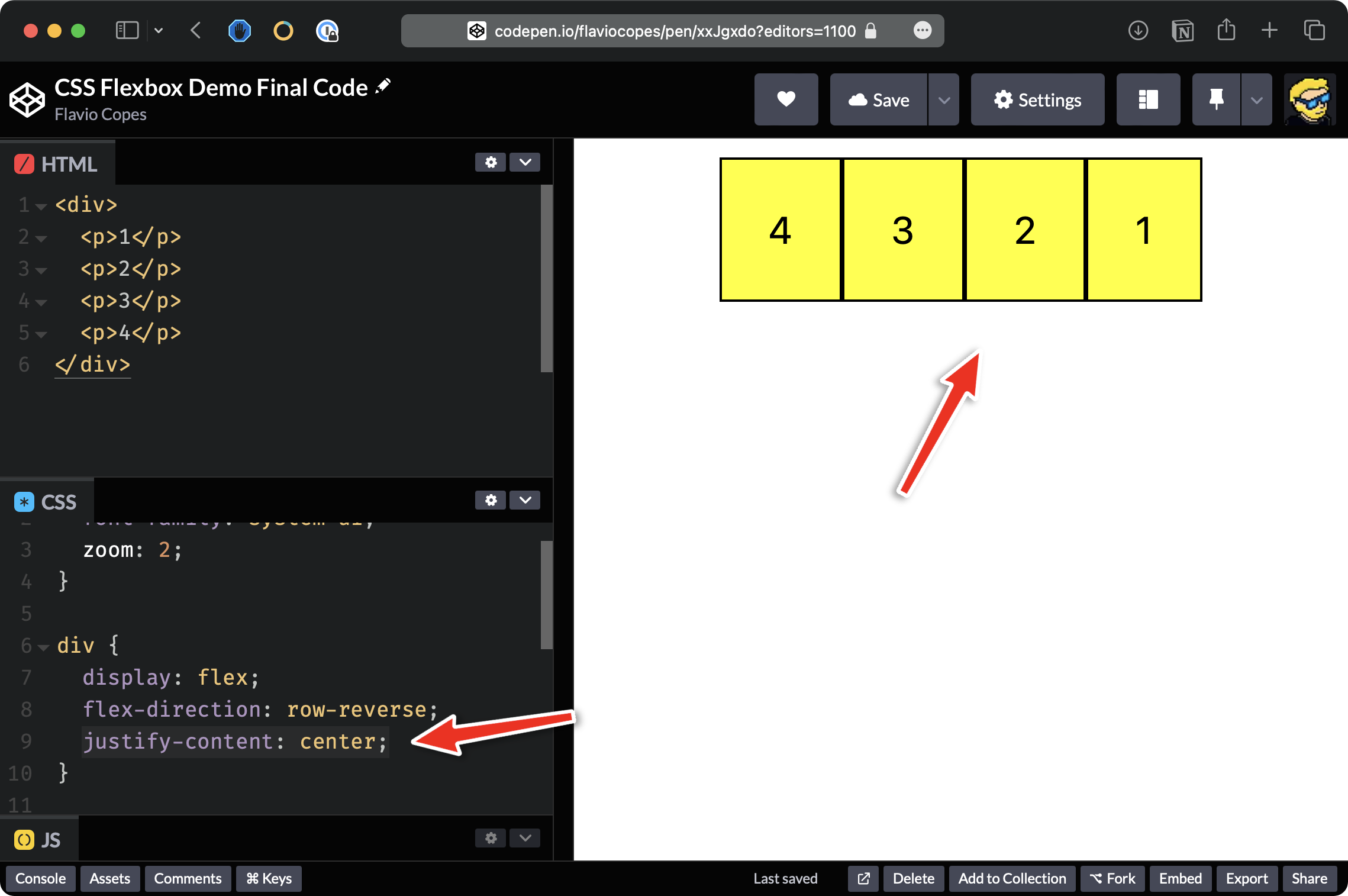
We can also put items in the center using justify-content: center;
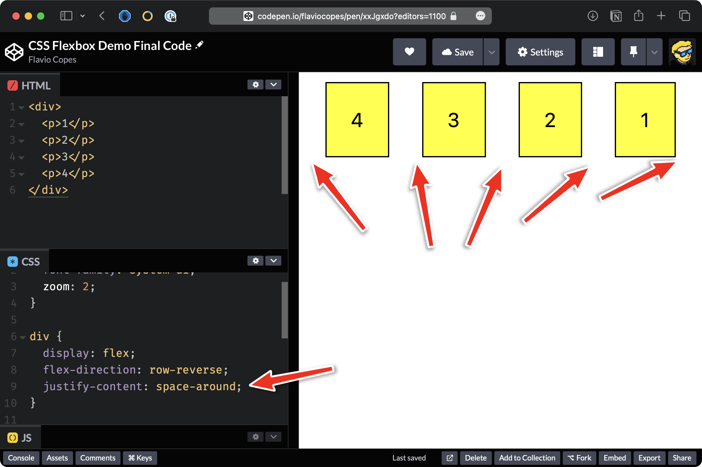
Let’s now try space-between which adds space between all the elements.
Also, we have space-around which adds some padding at the start and at the end.
As you can see here, we have a more balanced alignment of the elements:
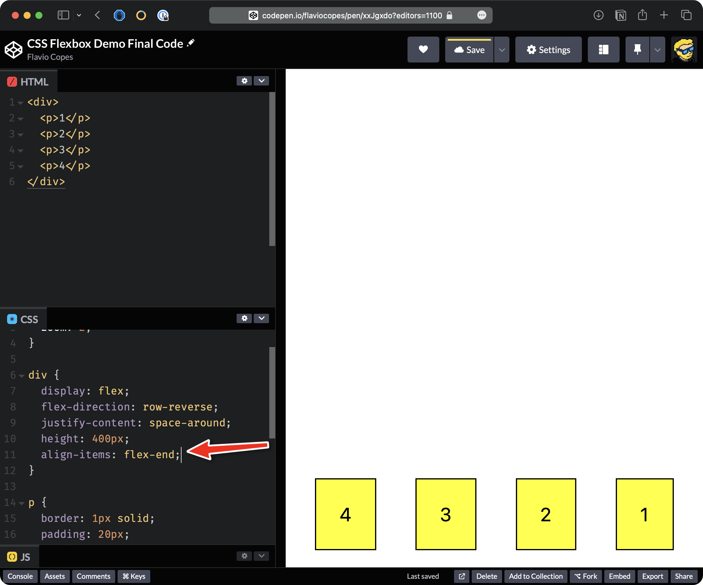
The align-items property is useful when you have a set height on the container. For example, we can set this to 400 pixels.
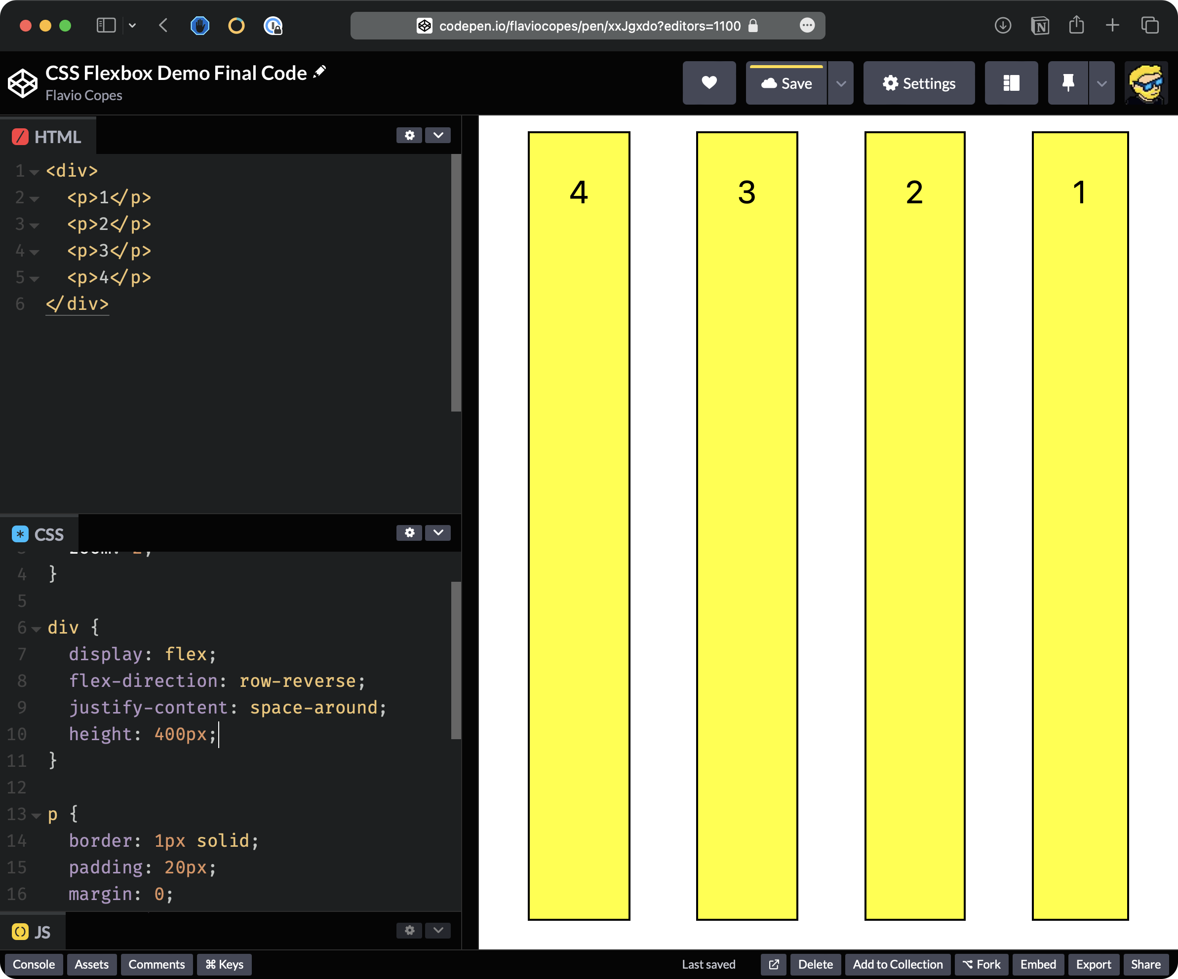
By default, the elements fill the entire height of the container.
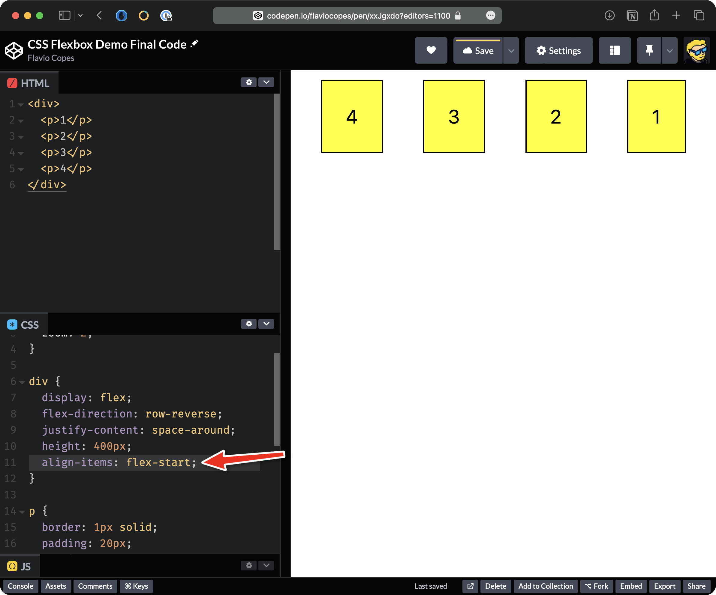
We can set align-items to be flex-start so items are aligned at the start and just fill the space they need:
We could use flex-end to align them at the end.
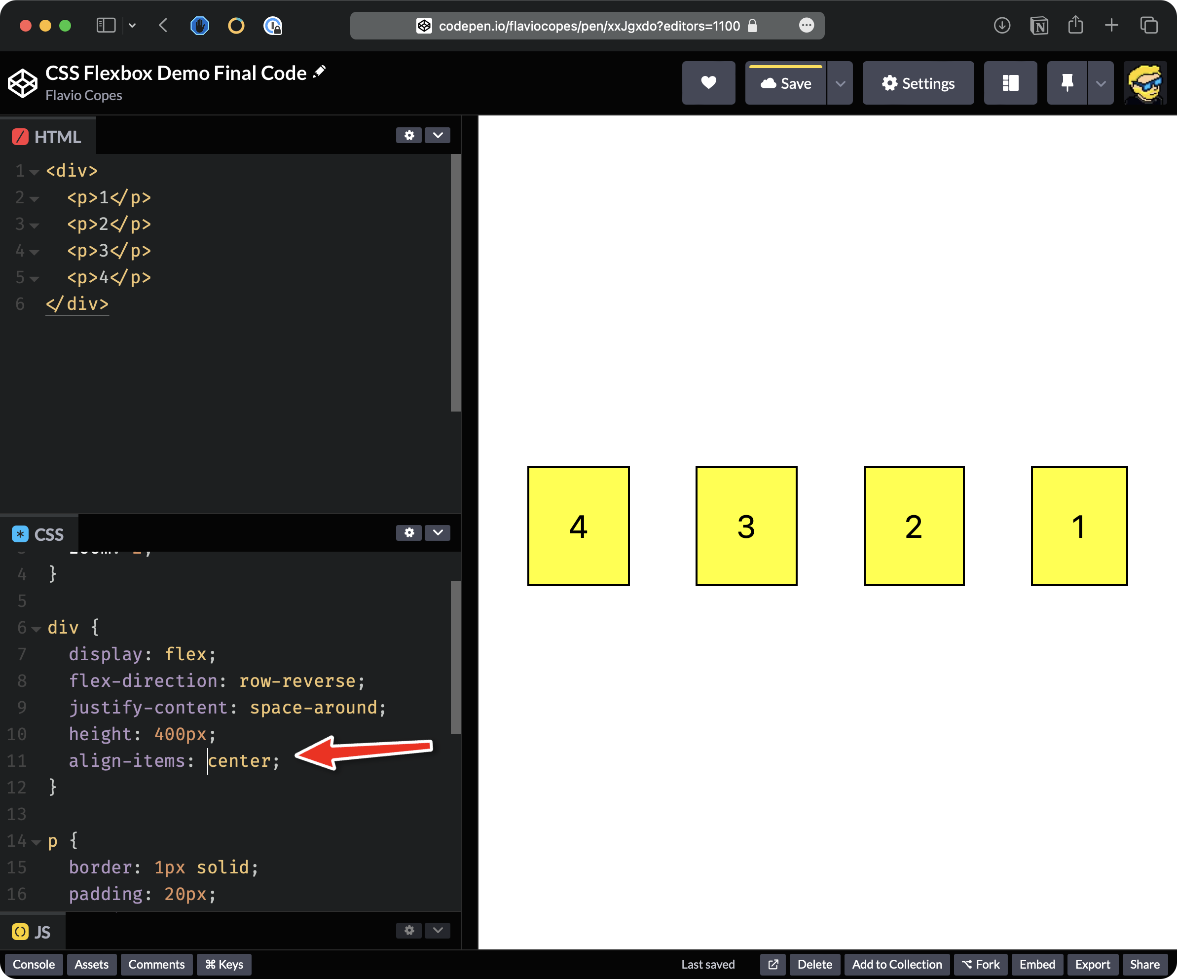
We can say center to center them vertically.
Let’s now add more elements to the HTML, for example, 8 items.
Let’s also remove all the CSS we added to the div except for display: flex:
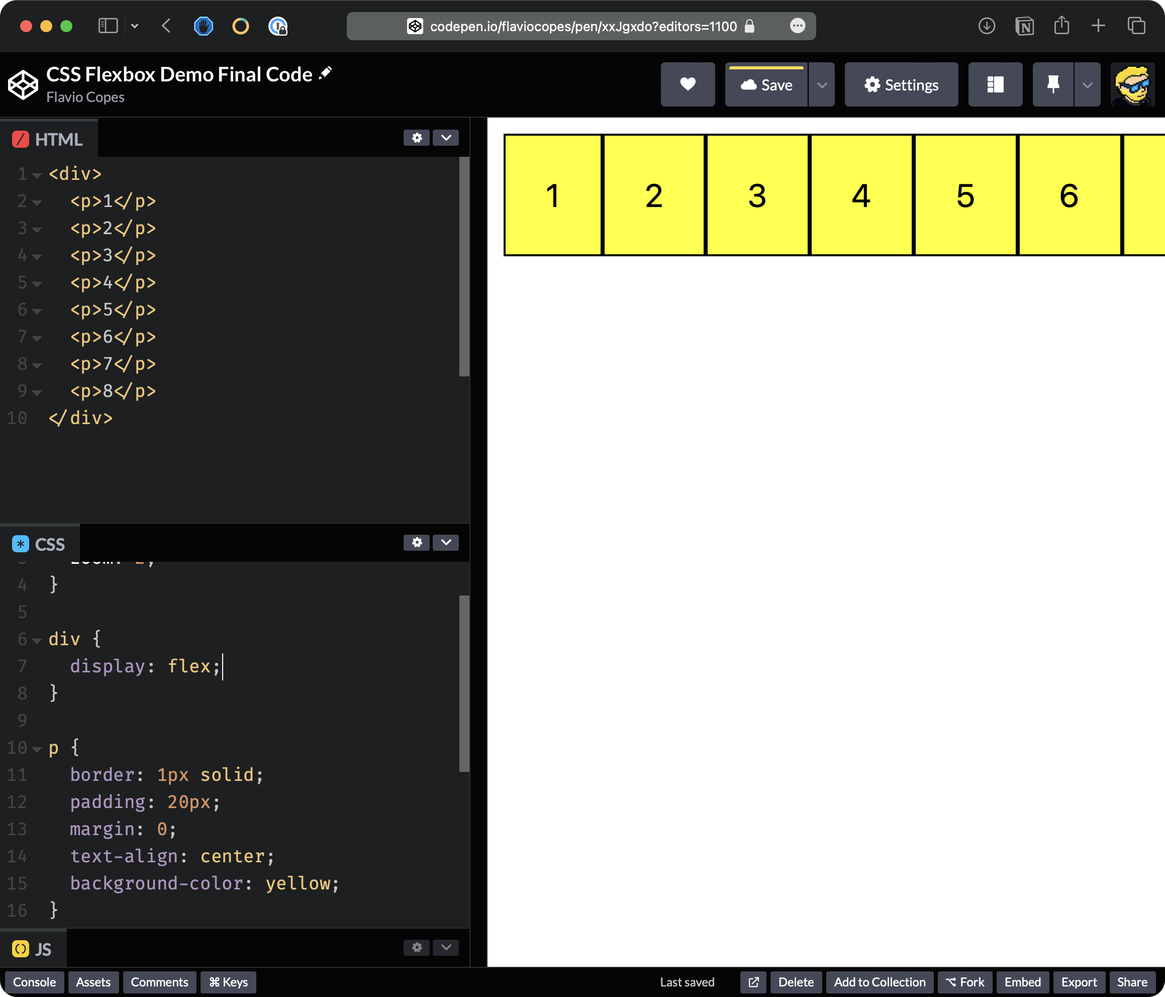
Flexbox tries to keep all items on the same line. But the screen is not large enough to display them, and they are overflowing, disappearing from the page.
What we can do is we can add flex-wrap: wrap:
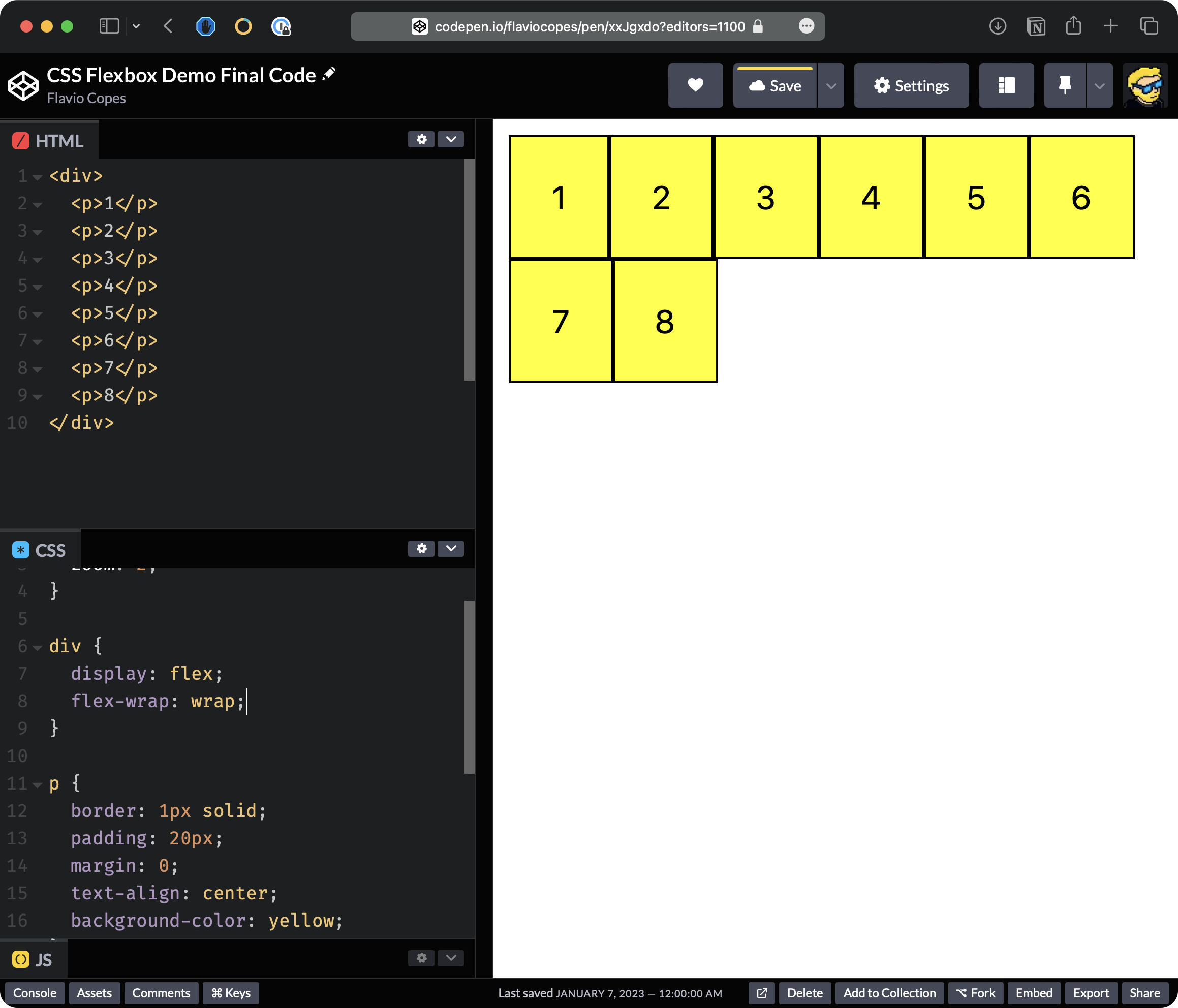
Flexbox now aligns items on two separate lines.
Here’s the final code on Codepen.
That’s it for this little demo. I hope this clarified a little bit about how to use flexbox and why it is so powerful and important.